
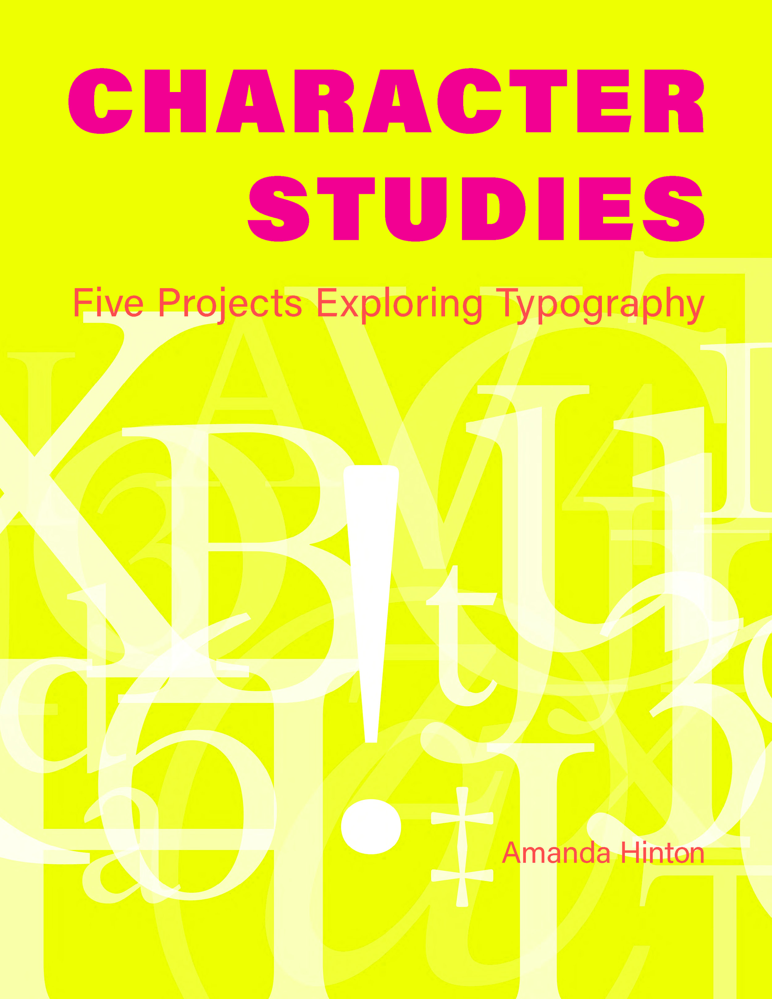
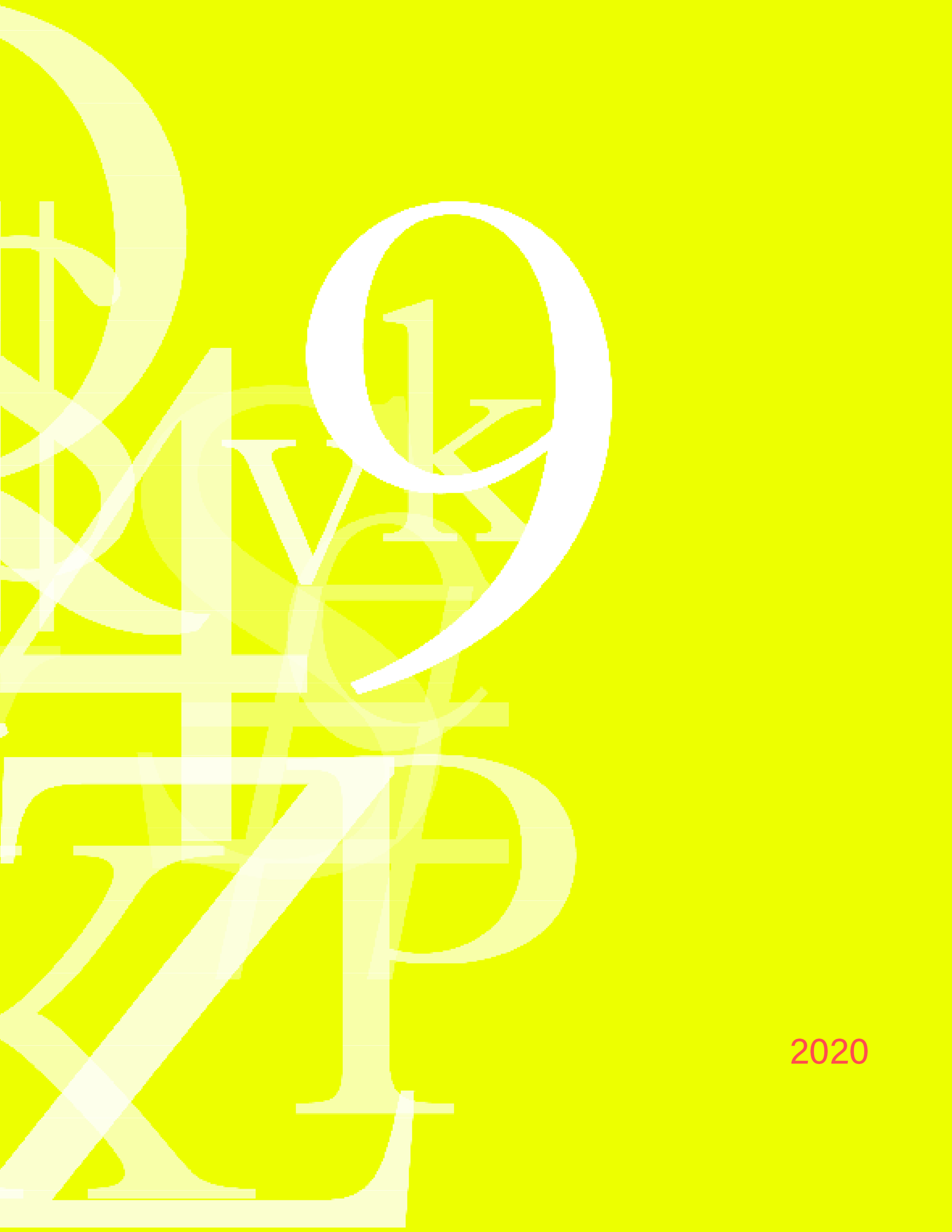
Character Studies Book of Typography Projects
Character Studies: Five Projects Exploring Typography visualizes my study of typesetting techniques, typeface characteristics, and type history.
Deliverables: Editorial Design, Typeface Creation, Typesetting, Research, Poster Design, Book Fabrication
Tools: Adobe InDesign and Adobe Illustrator

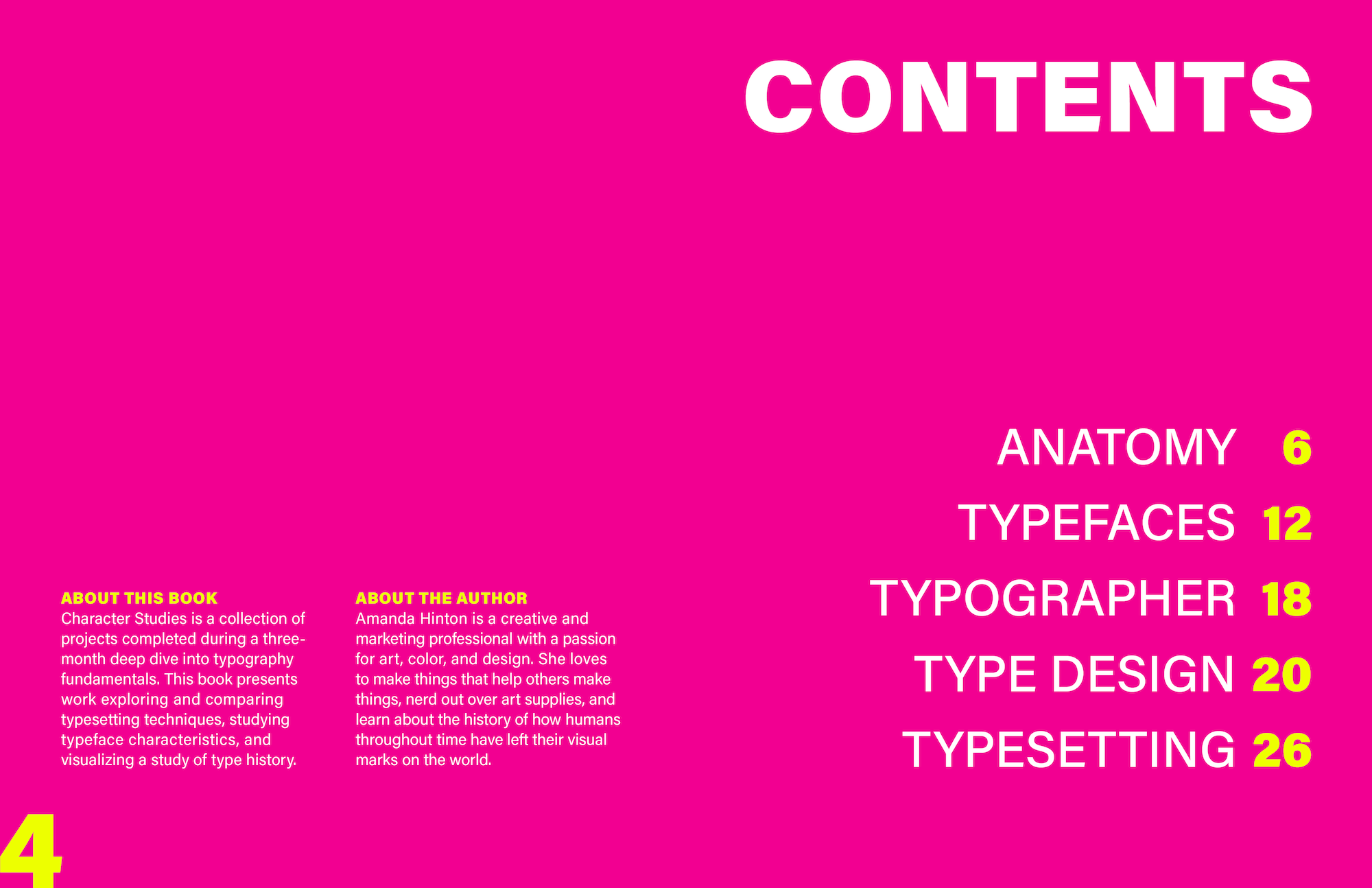
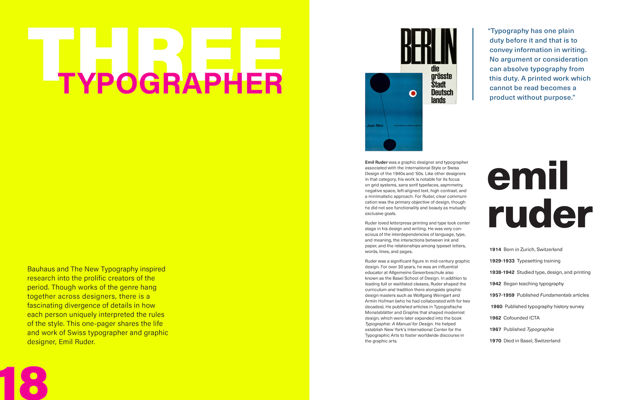
About Character Studies
This book is a collection of projects completed during a three-month deep dive into typography fundamentals. The book itself was designed not only as a mini-portfolio to showcase the projects, but to be a beautiful piece of editorial design itself.
The Portfolio Book
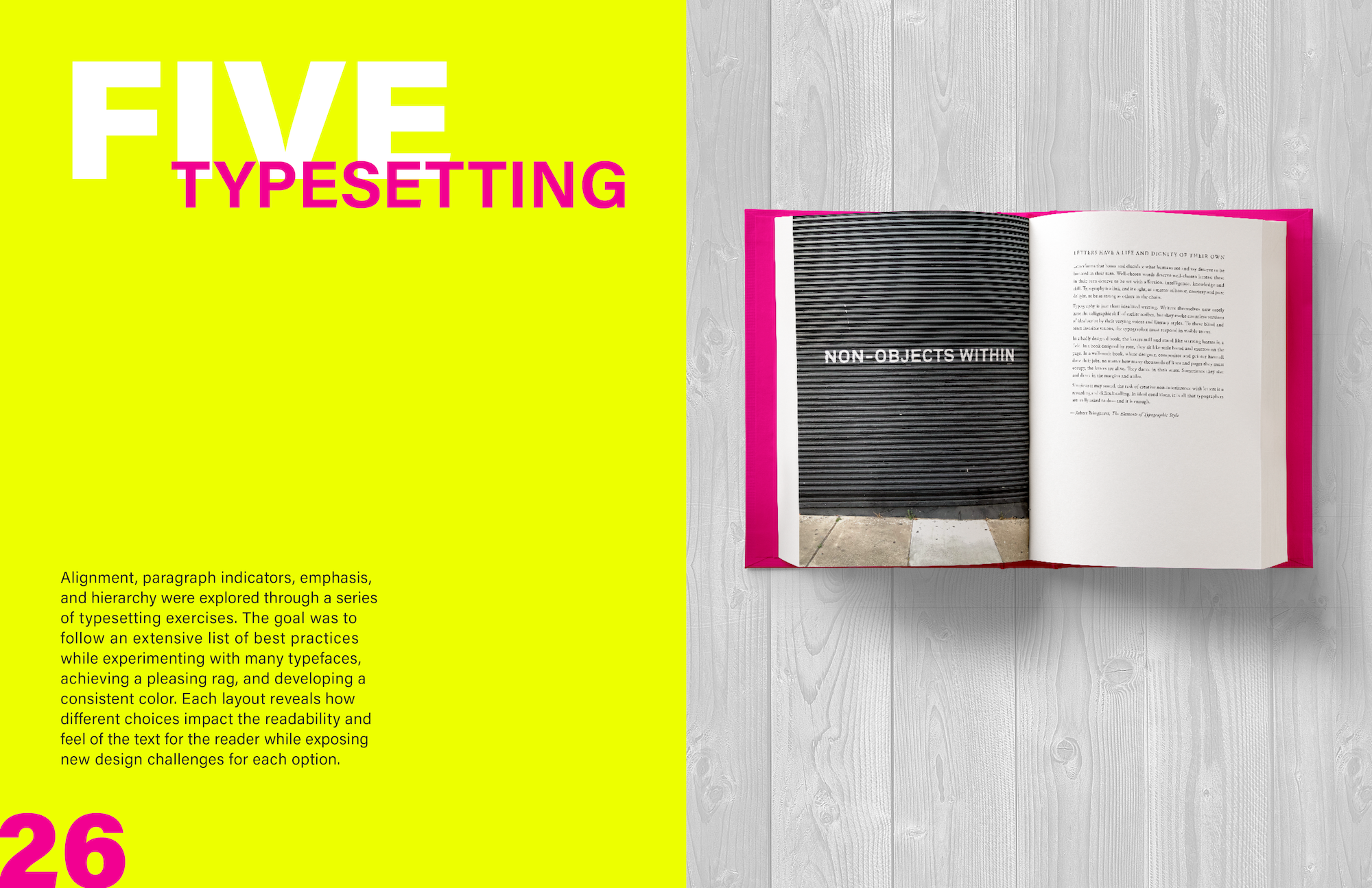
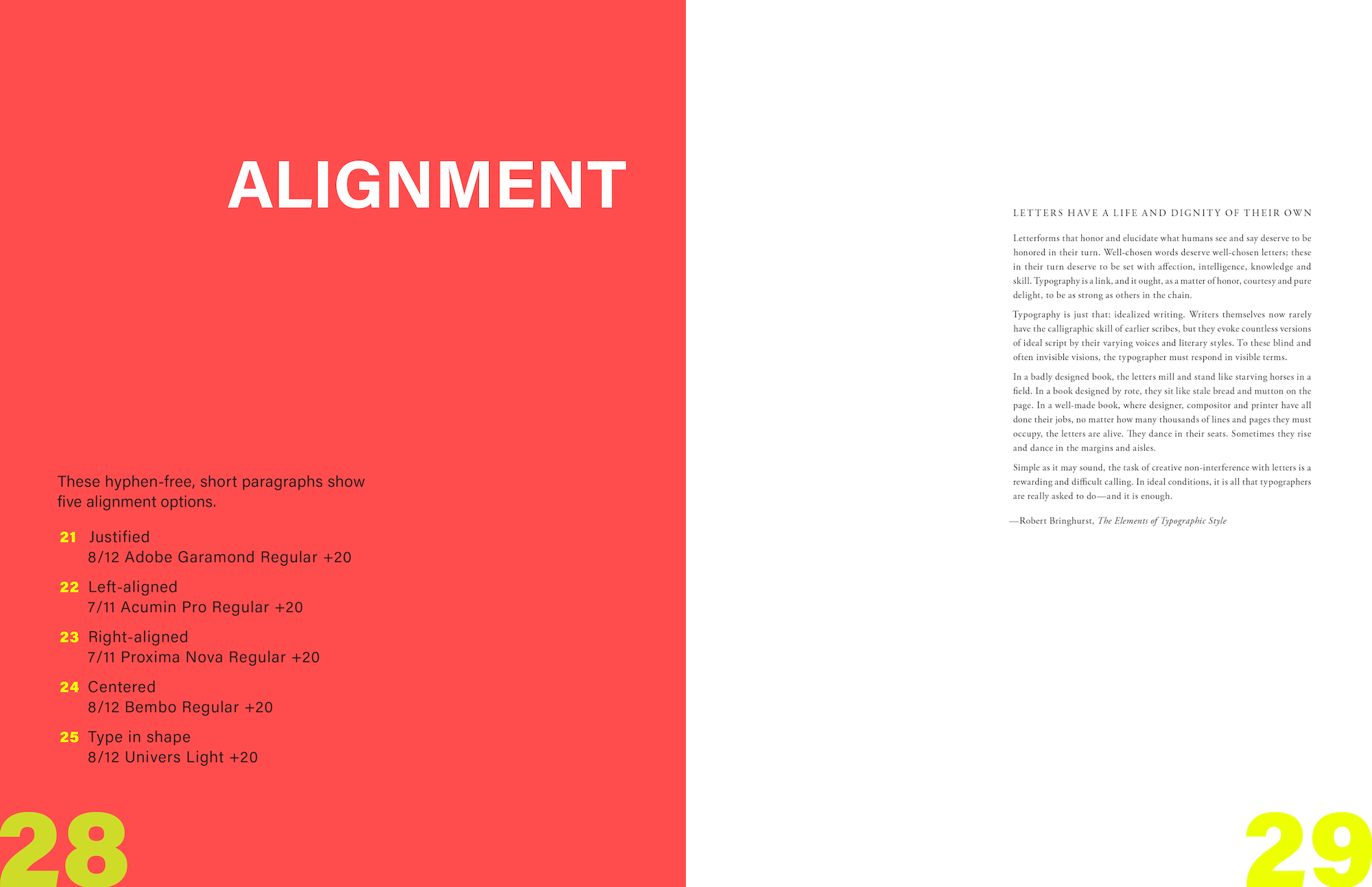
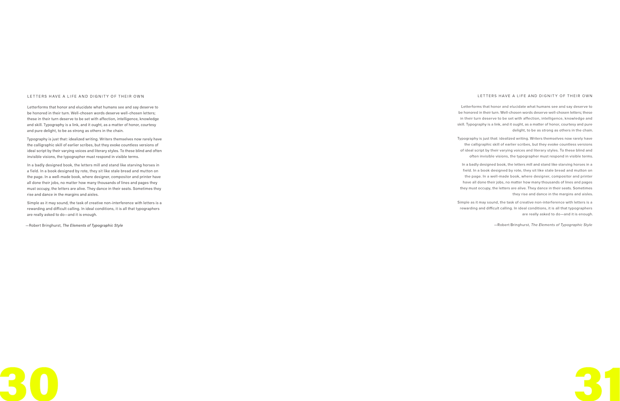
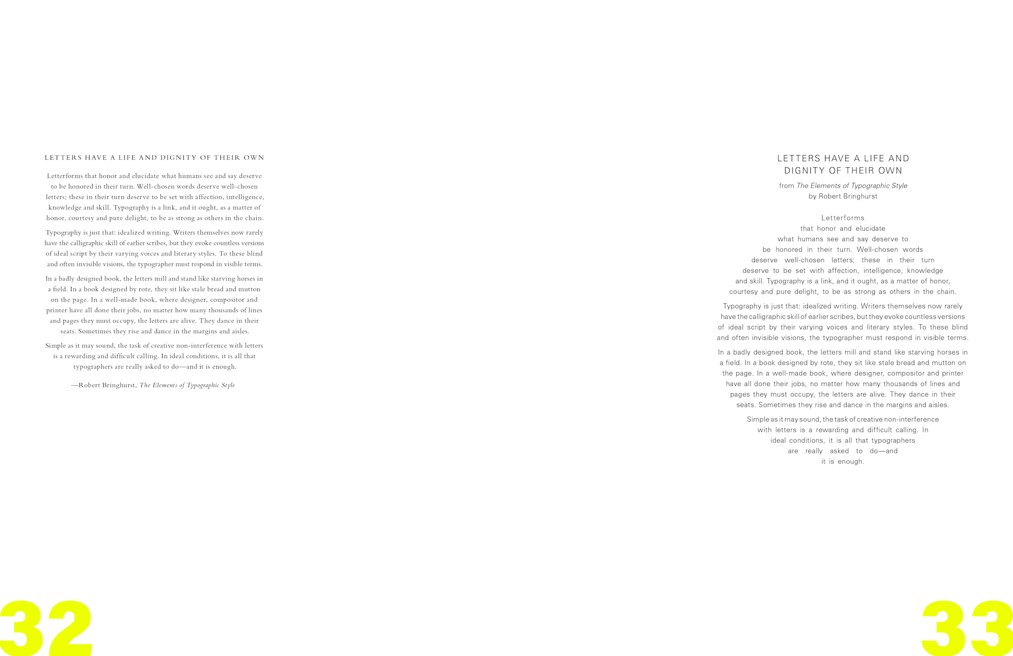
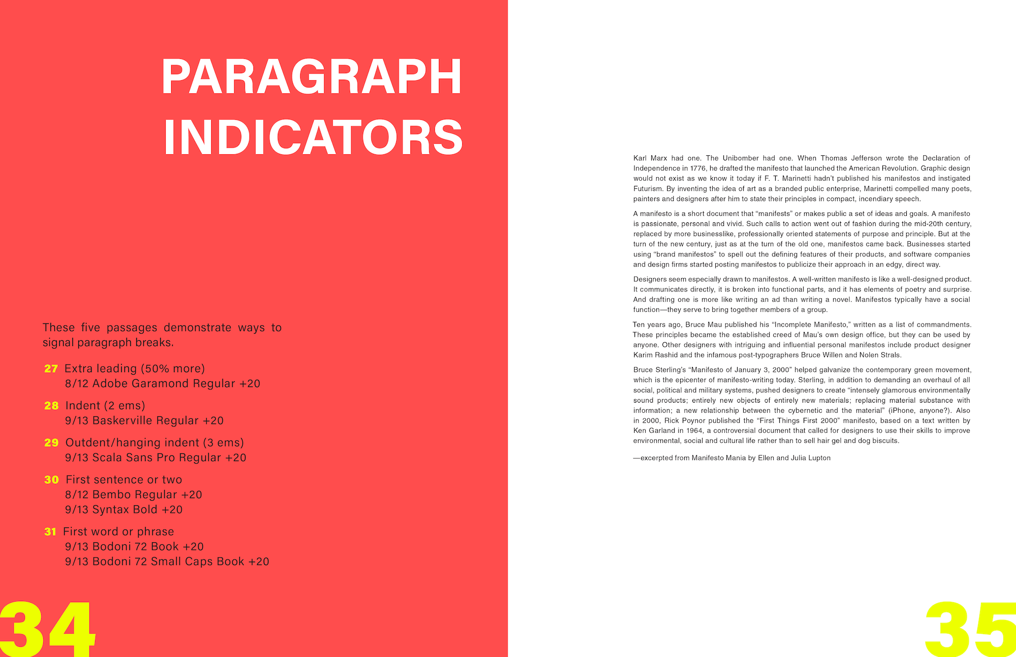
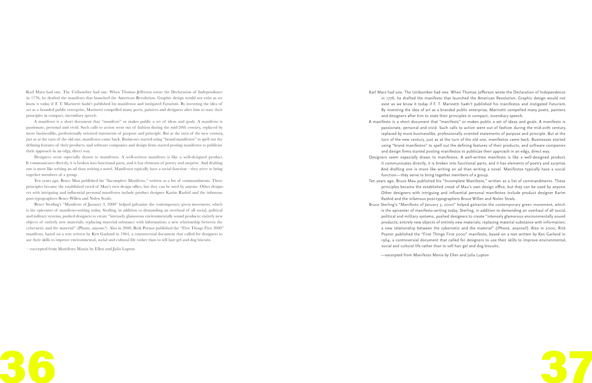
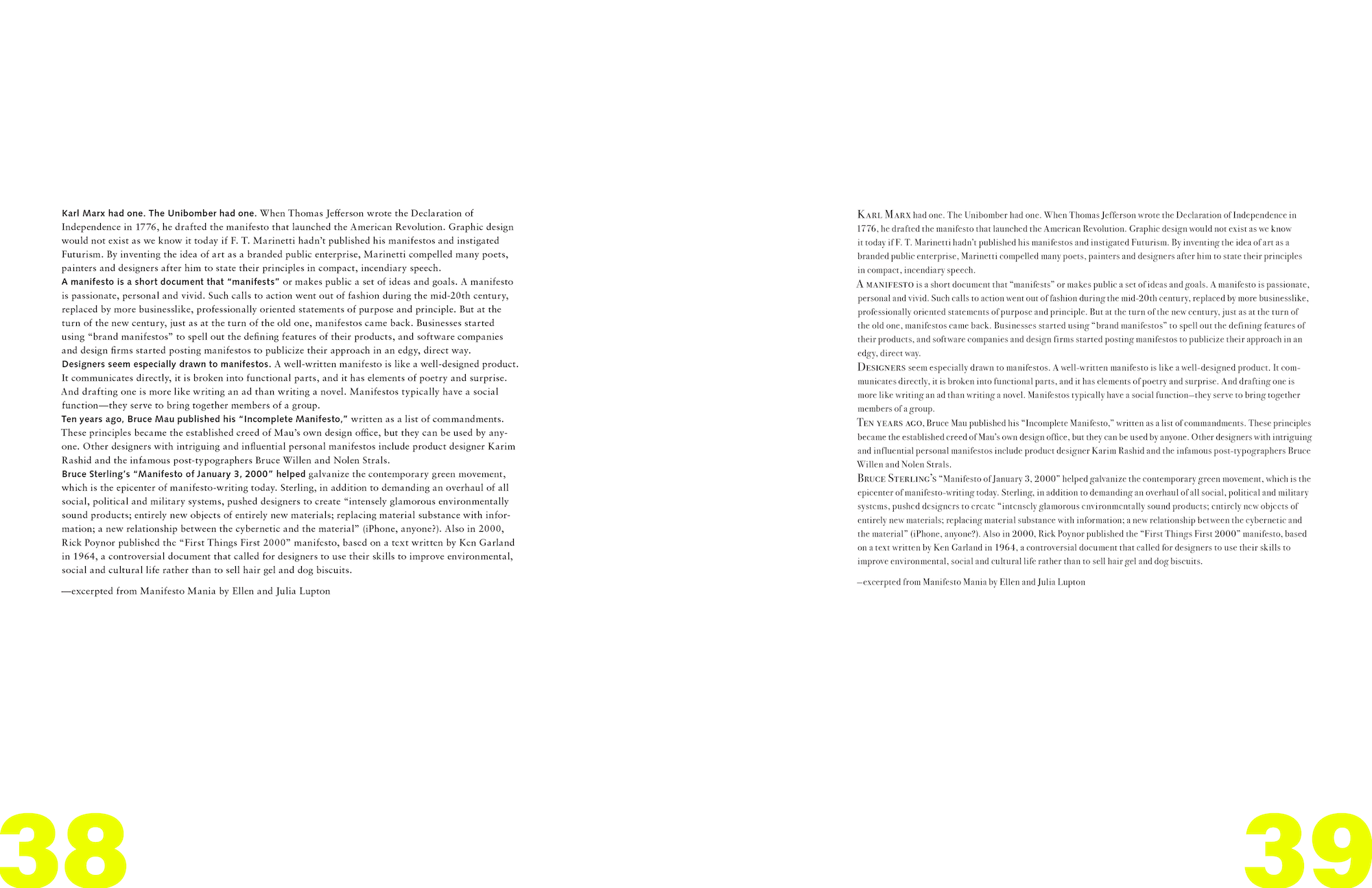
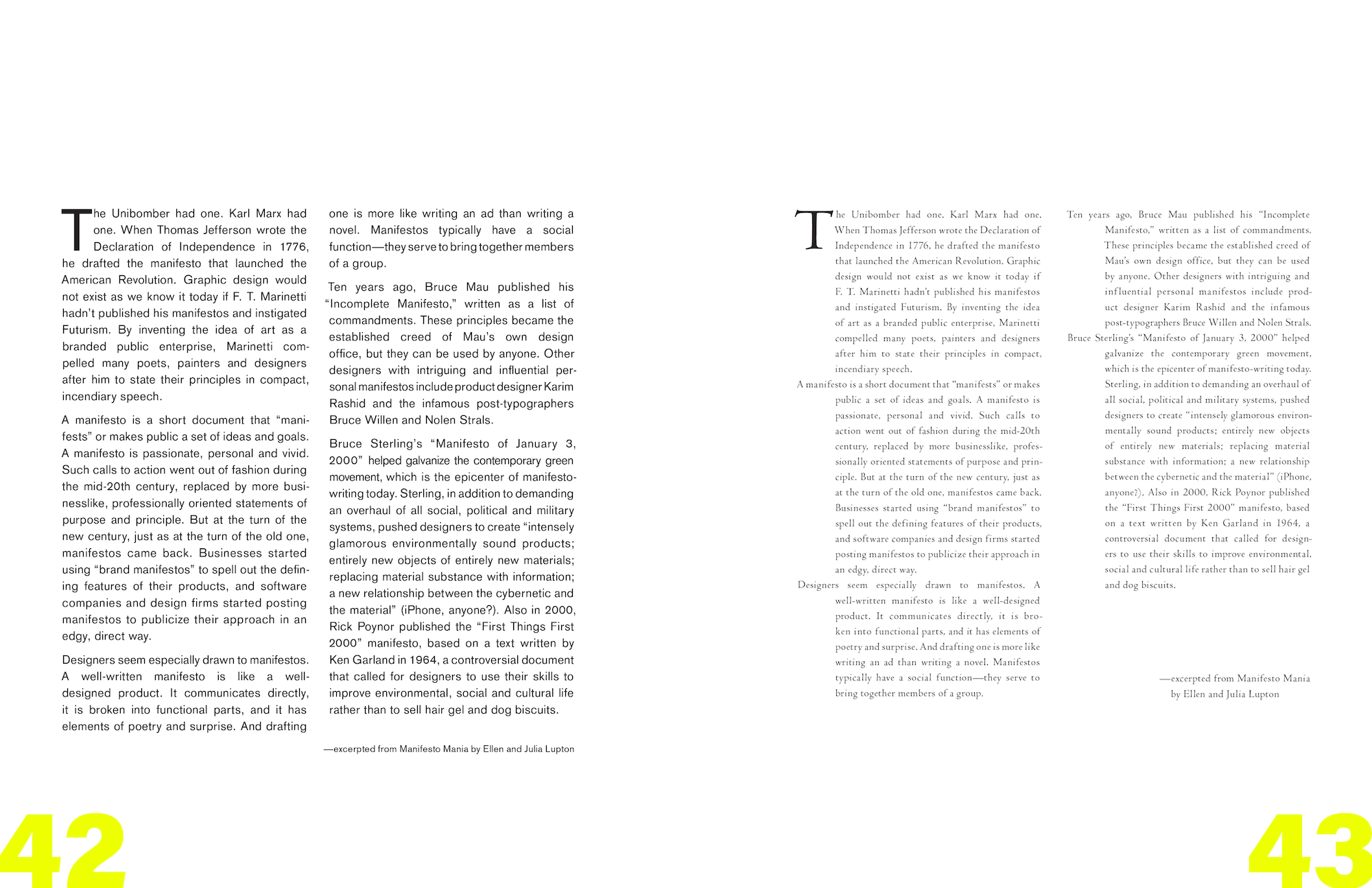
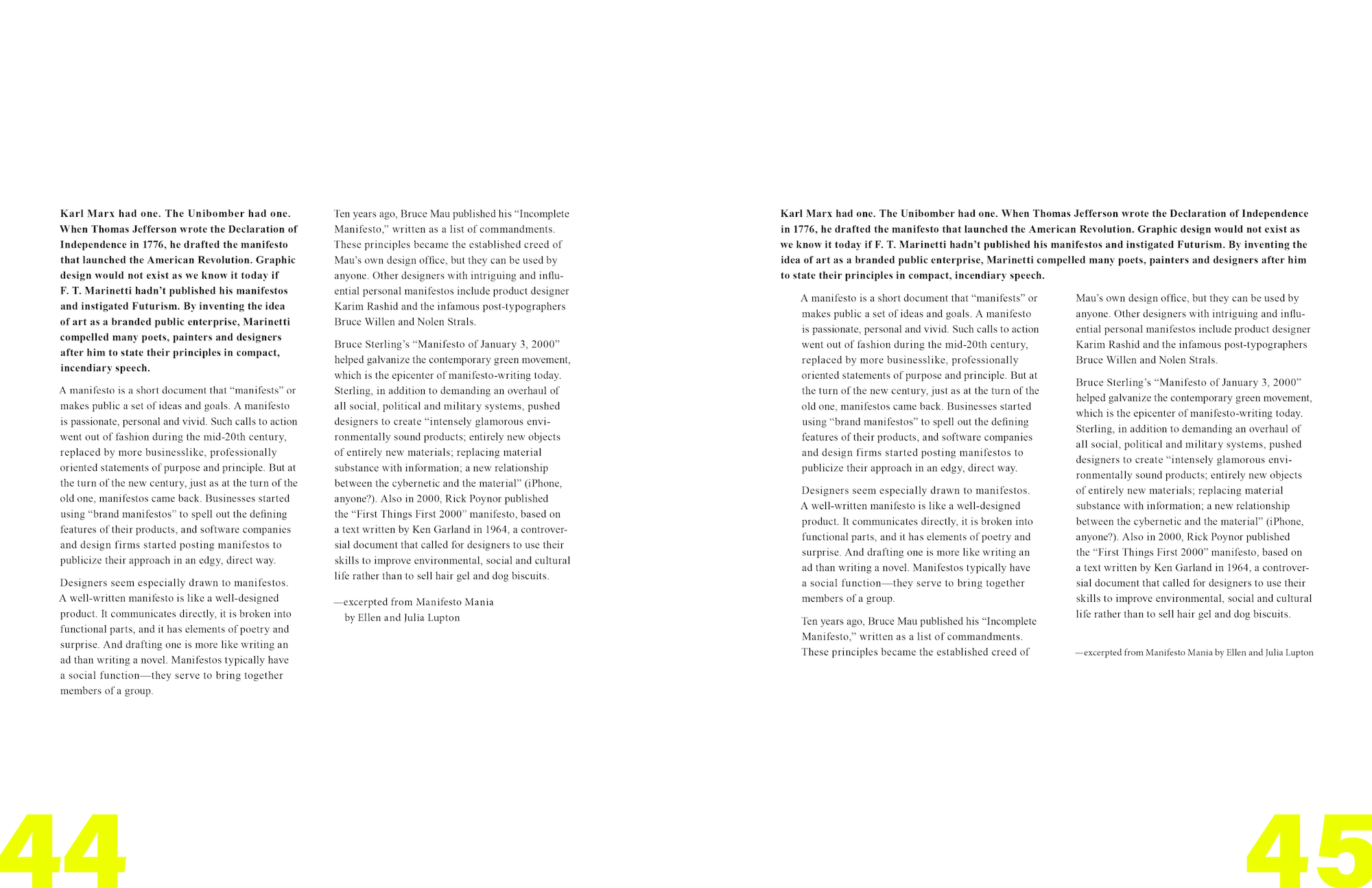
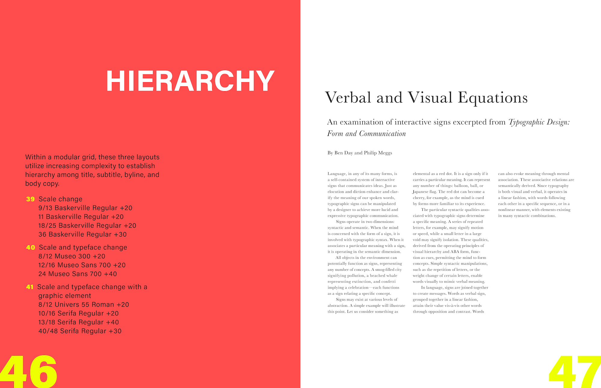
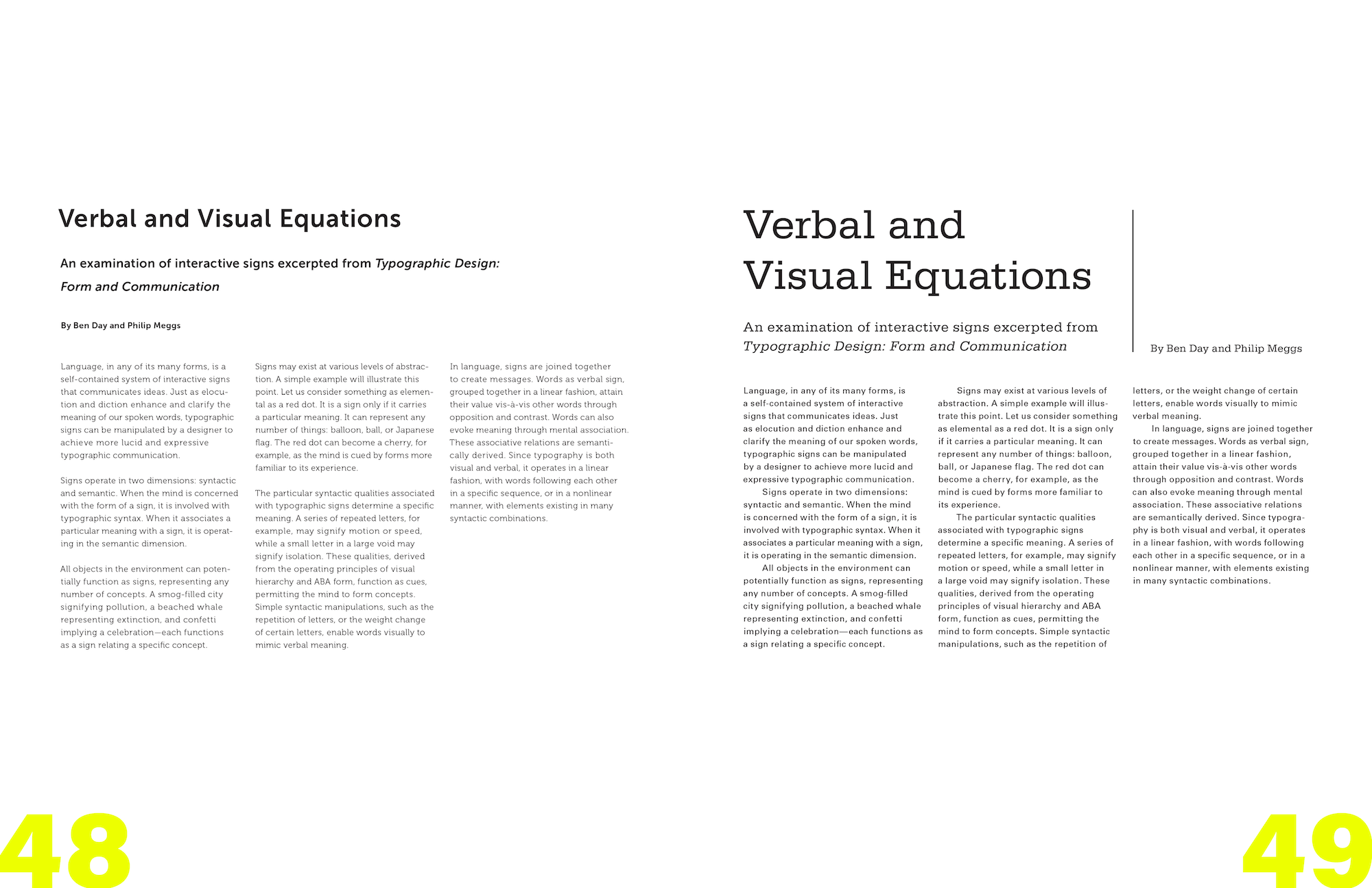
Character Studies arranges five typography projects as individual chapters. Color fields indicate chapter sections and subsections. Each project is introduced with a spread that contains the description and goals for each project alongside a full-bleed mockup of the project or a photo of the prototype. The subsequent pages show flat designs for individual components.
The book uses a firmly established modular grid along with a few visual elements from the individual projects (for example, the character pattern on the front and endpages comes from the anatomy project). It uses the colors and Acumin Pro typeface of my personal brand.

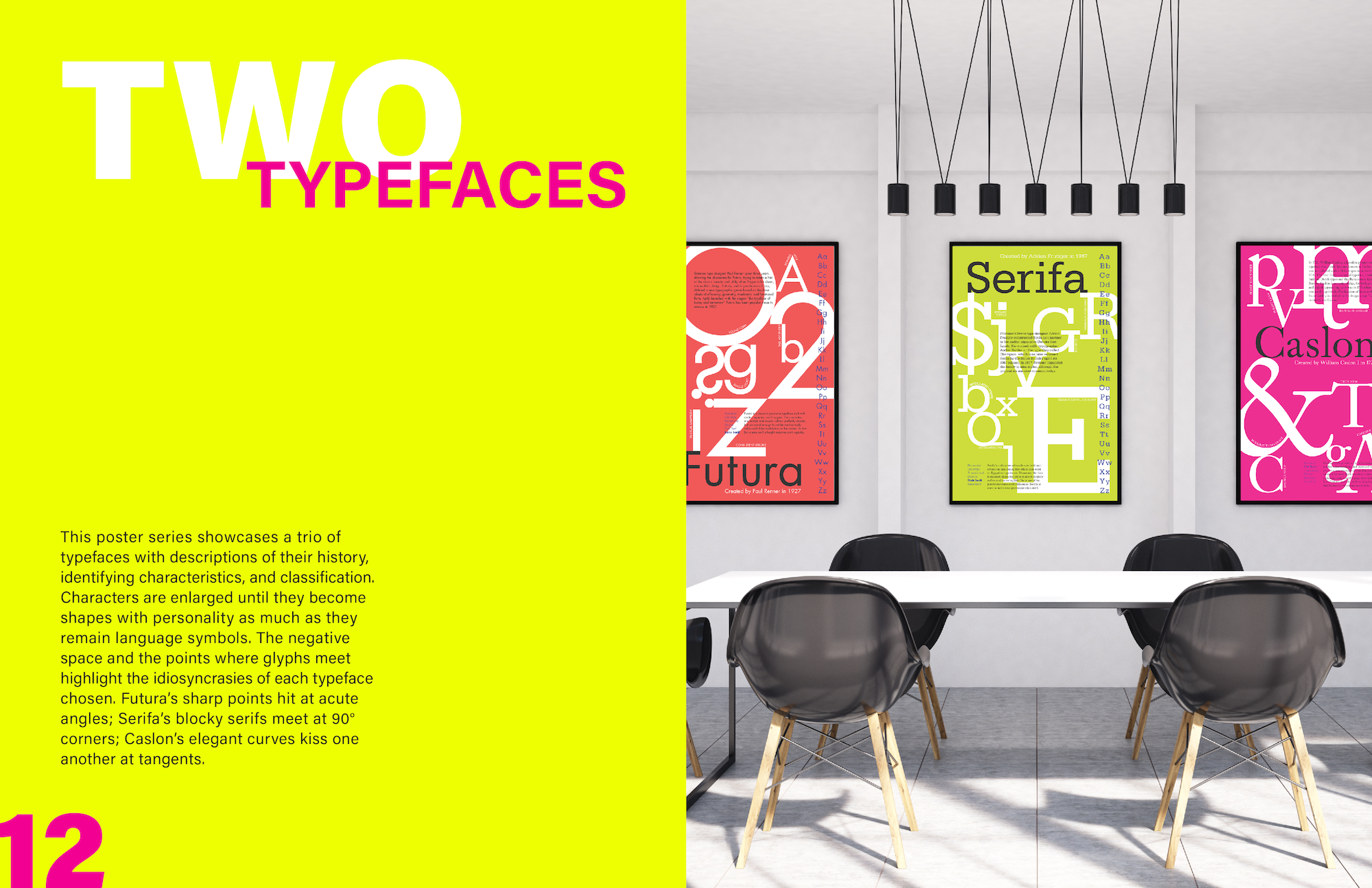
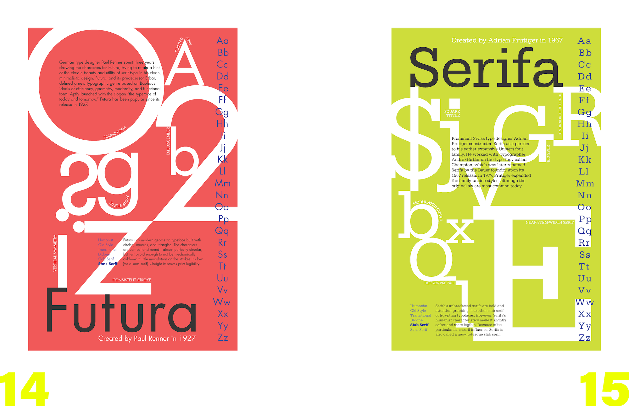


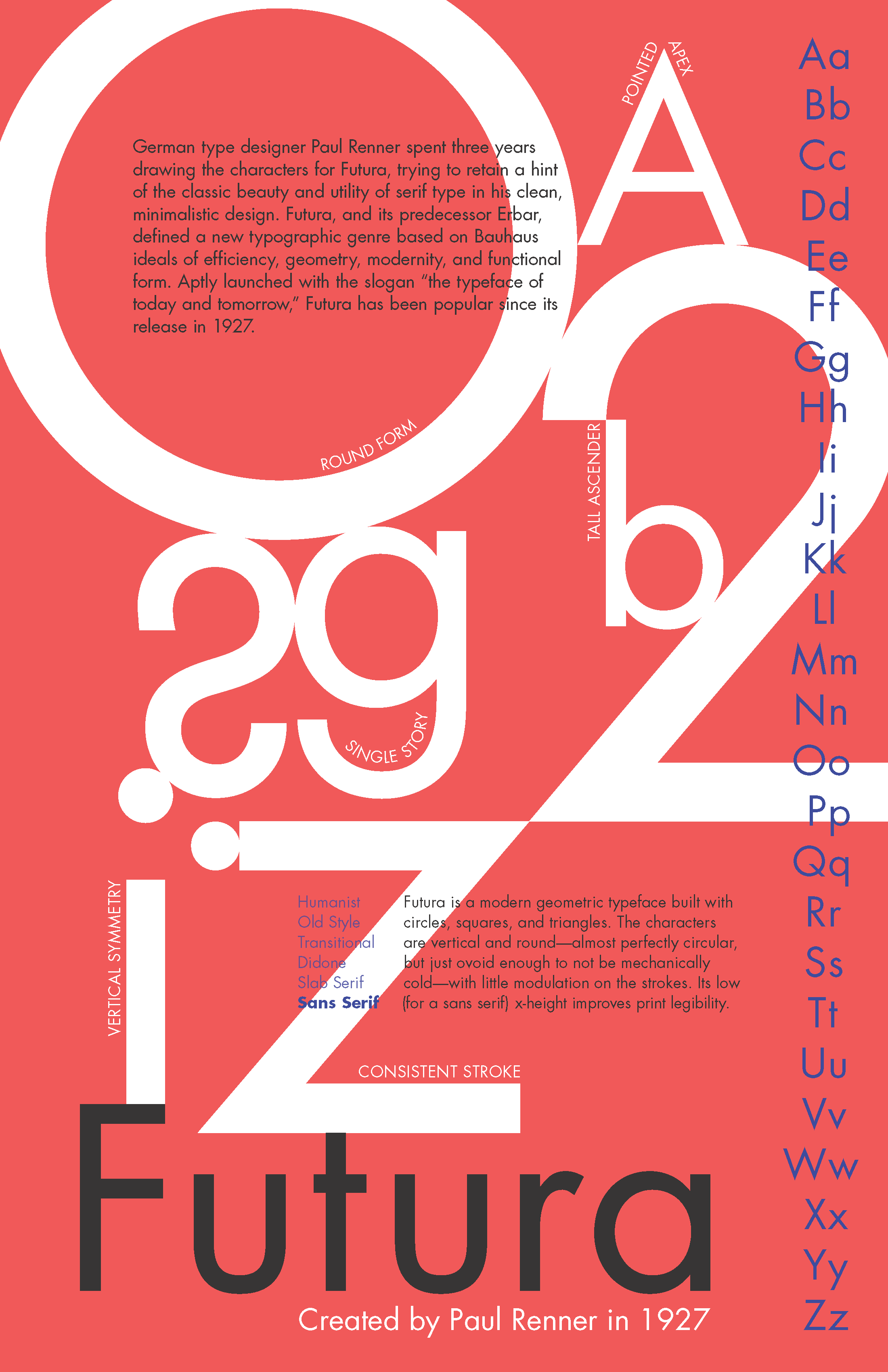
Typeface Poster Trio
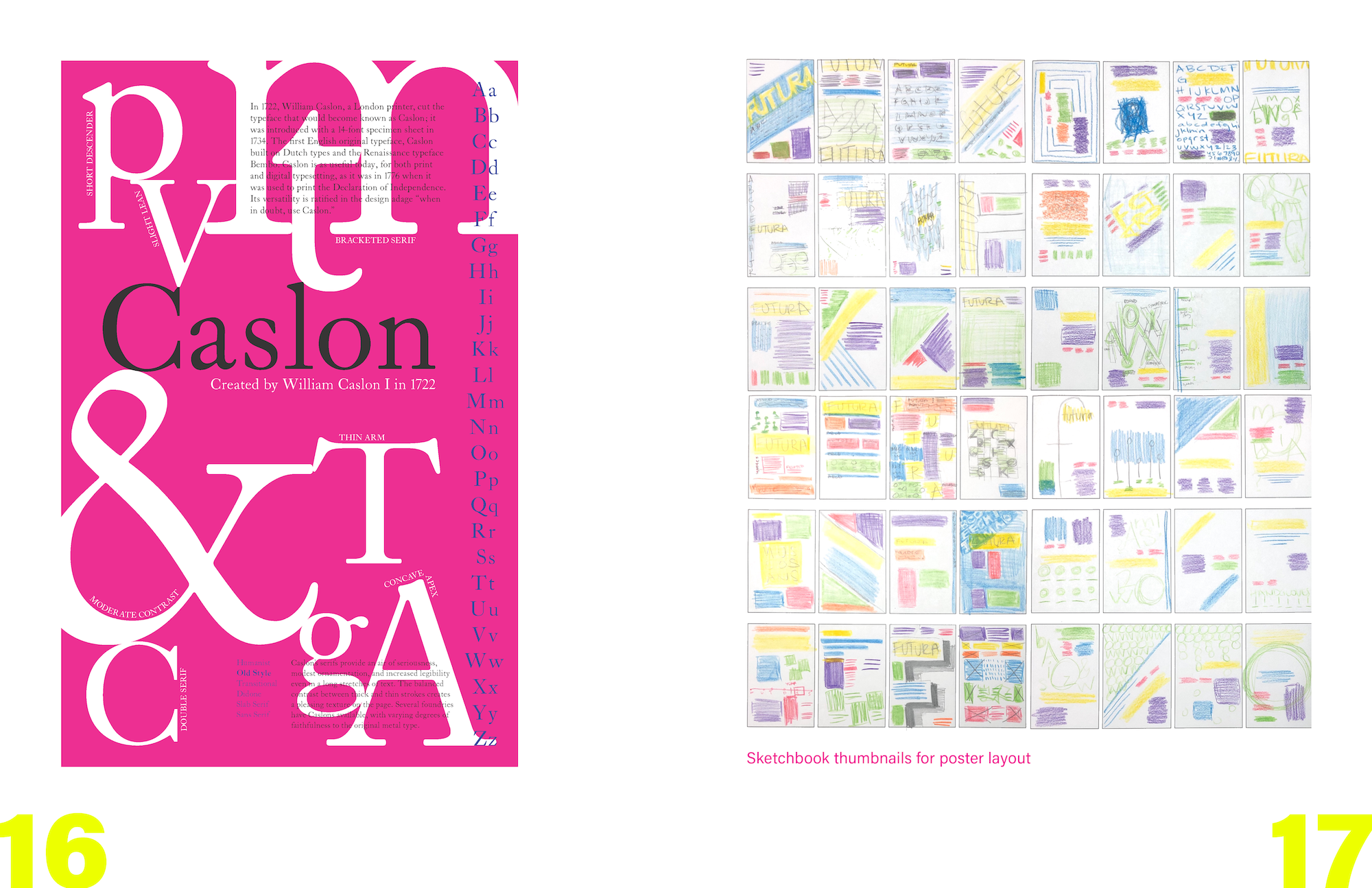
This poster series showcases a trio of typefaces with descriptions of their history, identifying characteristics, and classification. Characters are enlarged until they become shapes with personality as much as they remain language symbols. The negative space and the points where glyphs meet highlight the idiosyncrasies of each typeface chosen. Futura’s sharp points hit at acute angles; Serifa’s blocky serifs meet at 90° corners; Caslon’s elegant curves kiss one another at tangents.


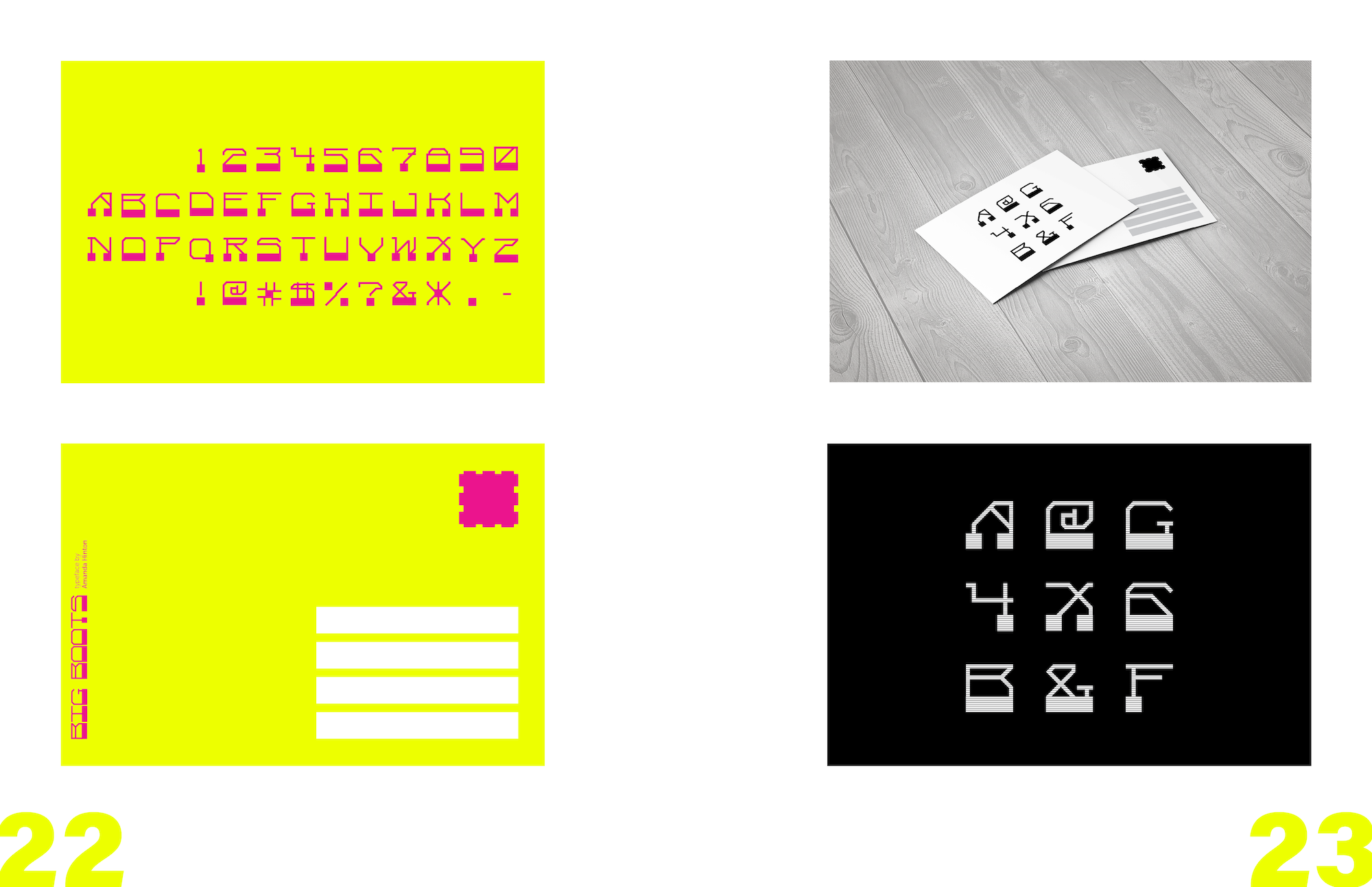
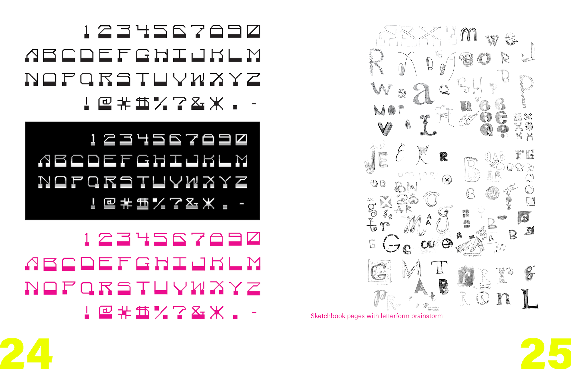
Big Boots Type Design
Big Boots is a playful, bottom-heavy take on a slab serif. Each character is built within a 3x3 grid using monoweight diagonal, vertical, and horizontal lines in the top two thirds with solid fill and squares in the lower third. Strict adherence to construction rules kept it all cohesive and created fun problems to solve. A pair of postcards display the full set and a few representative characters, the former with bold color and the latter in a striped monochrome pattern to reflect its slightly OCR-ish qualities.
Read more in the blog post here.


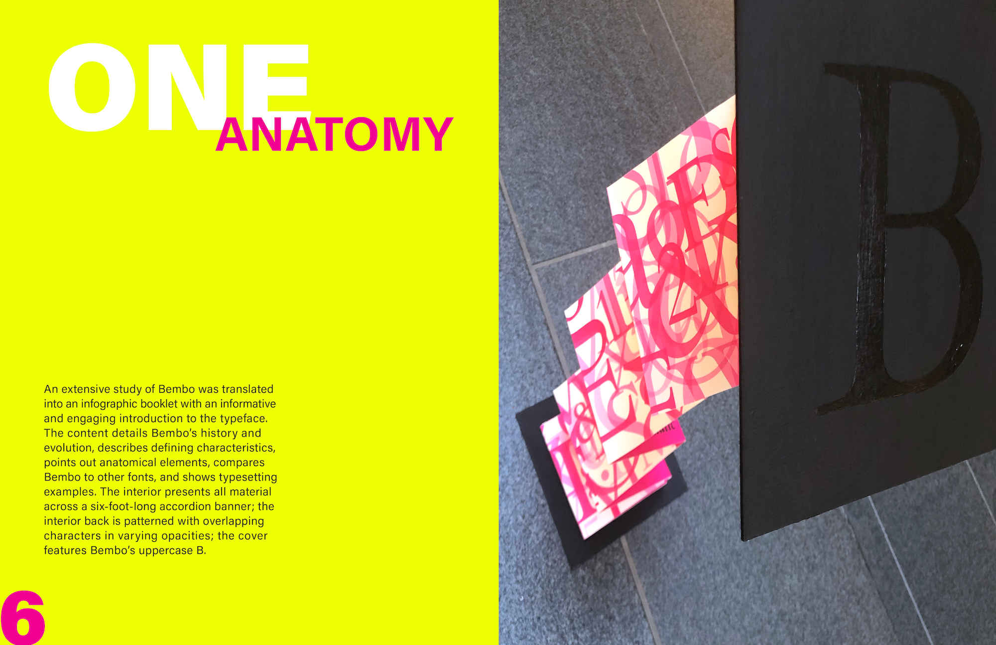
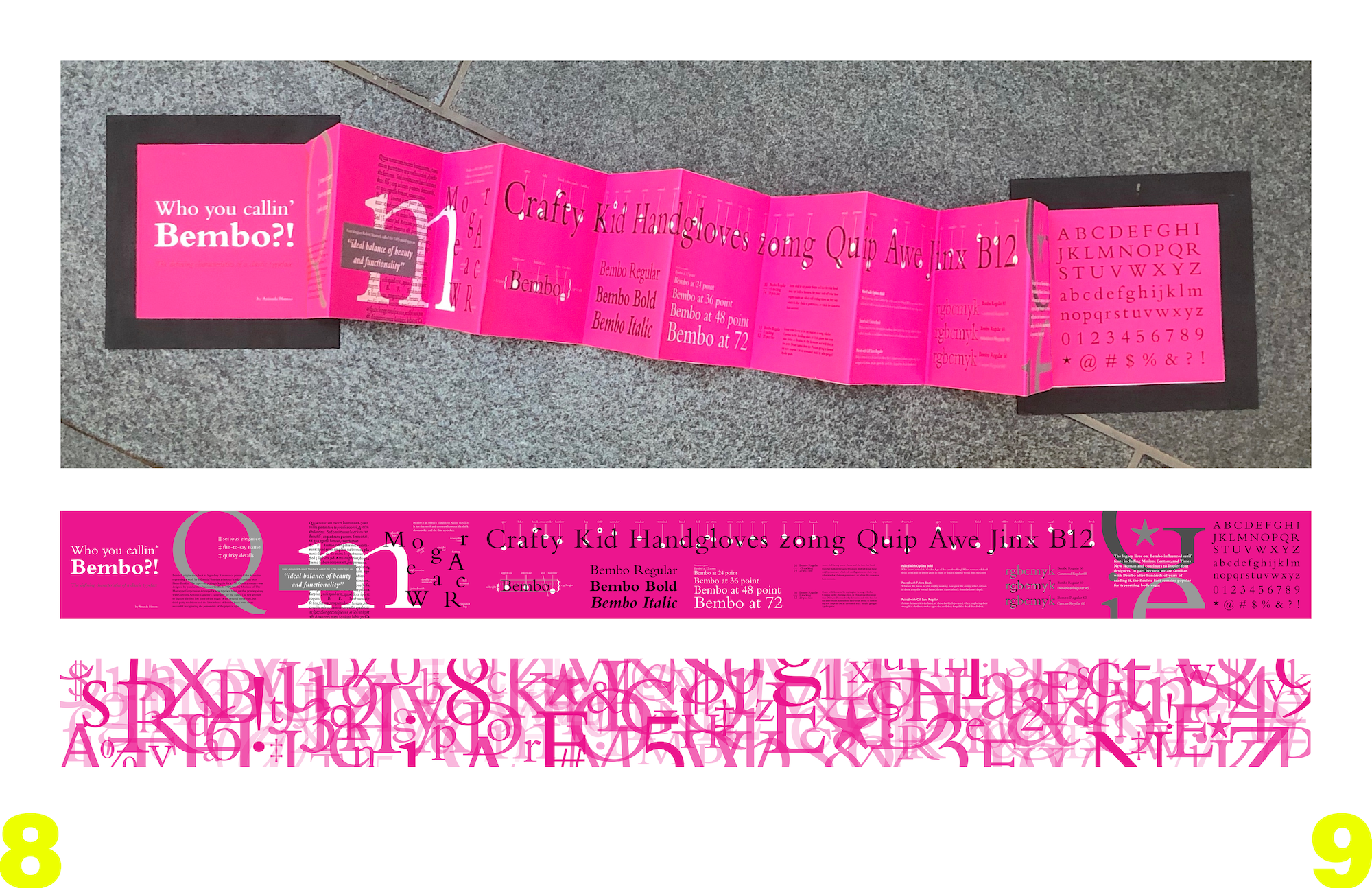
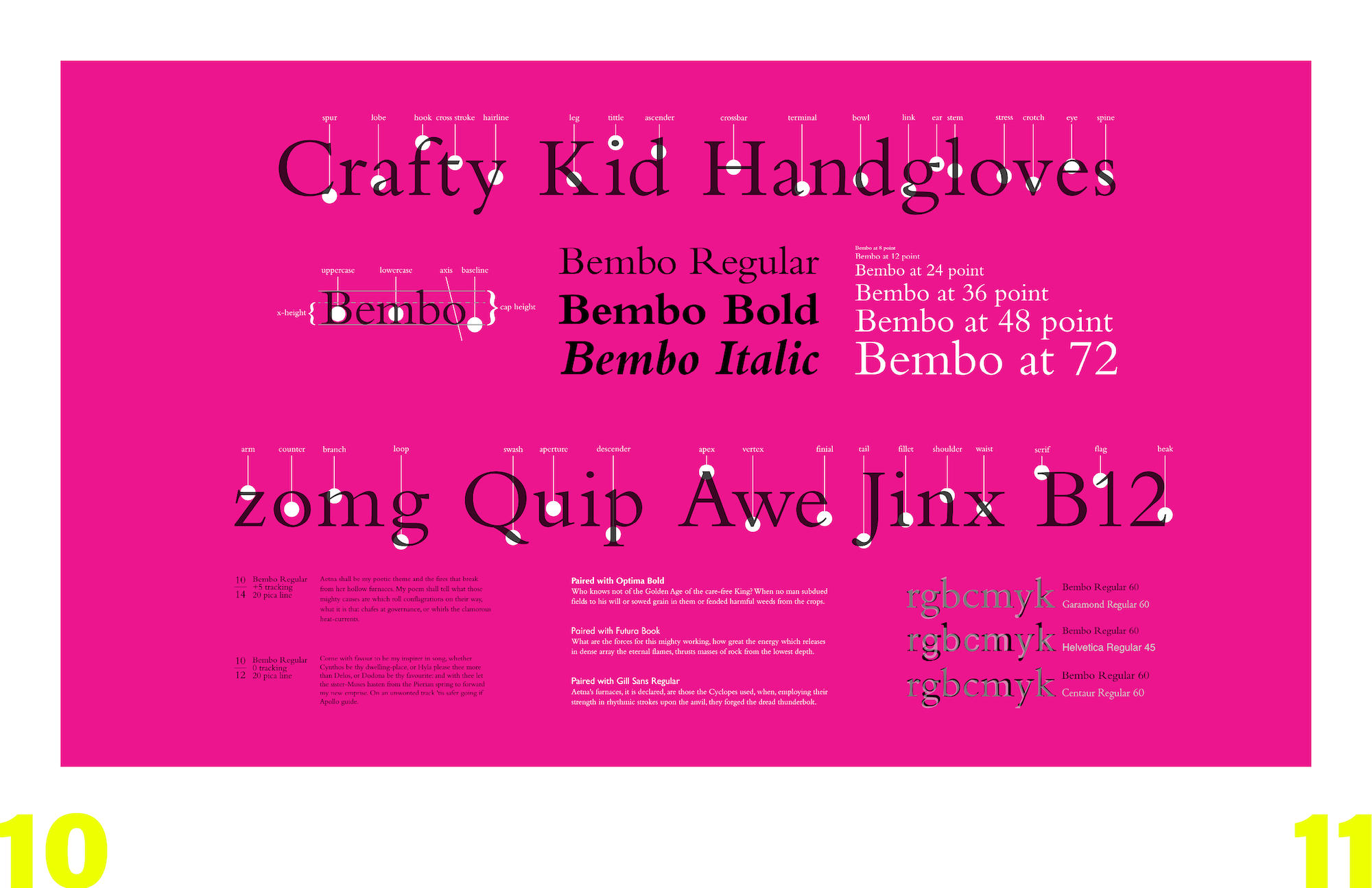
Type Anatomy Booklet
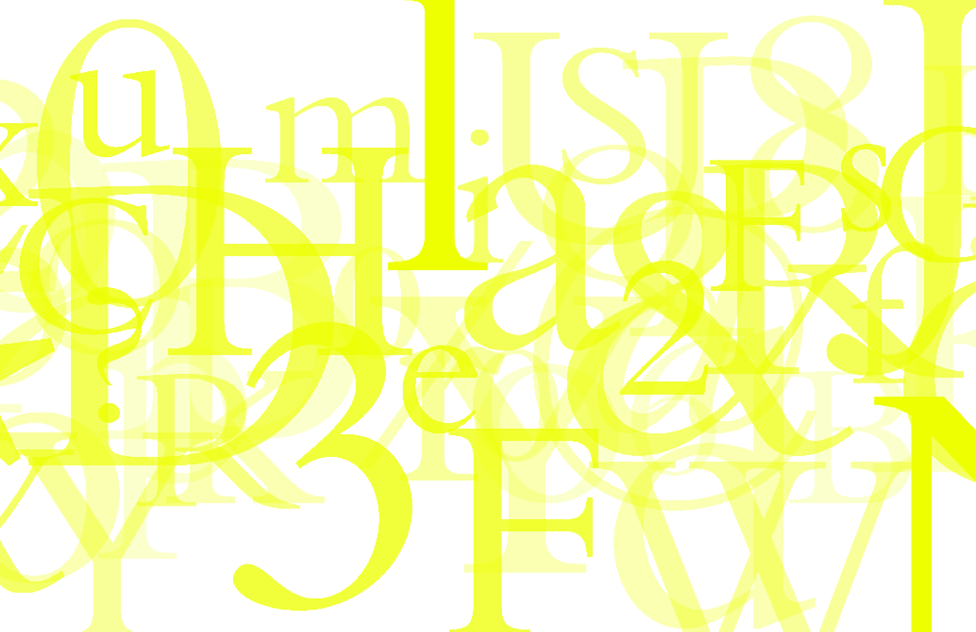
An extensive study of Bembo was translated into an infographic booklet with an informative and engaging introduction to the typeface. The content details Bembo’s history and evolution, describes defining characteristics, points out anatomical elements, compares Bembo to other fonts, and shows typesetting examples. The interior presents all material across a six-foot-long accordion banner; the interior back is patterned with overlapping characters in varying opacities; the cover features Bembo’s uppercase B.
Scroll across the full interior spread here.


Design Process
I created five projects of varying complexity, using Illustrator and InDesign. Final versions were used to create mock-ups of how each project might be presented to a viewer in books, posters, gallery, magazine pages, and a postcard.
For the three type comparison posters, I completed 48 thumbnail sketches of where the different elements might be placed: typeface name (yellow), alphabet (blue), large character samples(green), history (violet), classification (red), and description (orange).
Before deciding the direction for my typeface design, I filled sketchbook pages with potential letterforms. Then I sketched in Illustrator, a much different toolset and process. After deciding to pursue Big Boots, I went through weeks of iterative design-critique-adjust to make the set work together and to improve on the weaker characters.


See it on Behance

Design by Amanda Hinton
Mockup templates from Envato and PlaceIt