
Limn Colors Brand
The Limn Colors brand needed to be flexible enough in color and imagery to encompass a variety of painting styles and the full product line. As the market grew, it was important to have a distinctive, professional image to stand apart from the rush of new entrants.
Deliverables: Branding, Packaging, and Ad Creative
Tools: Adobe InDesign, Adobe Illustrator, Canva, paint, 3d printing

About Limn Colors
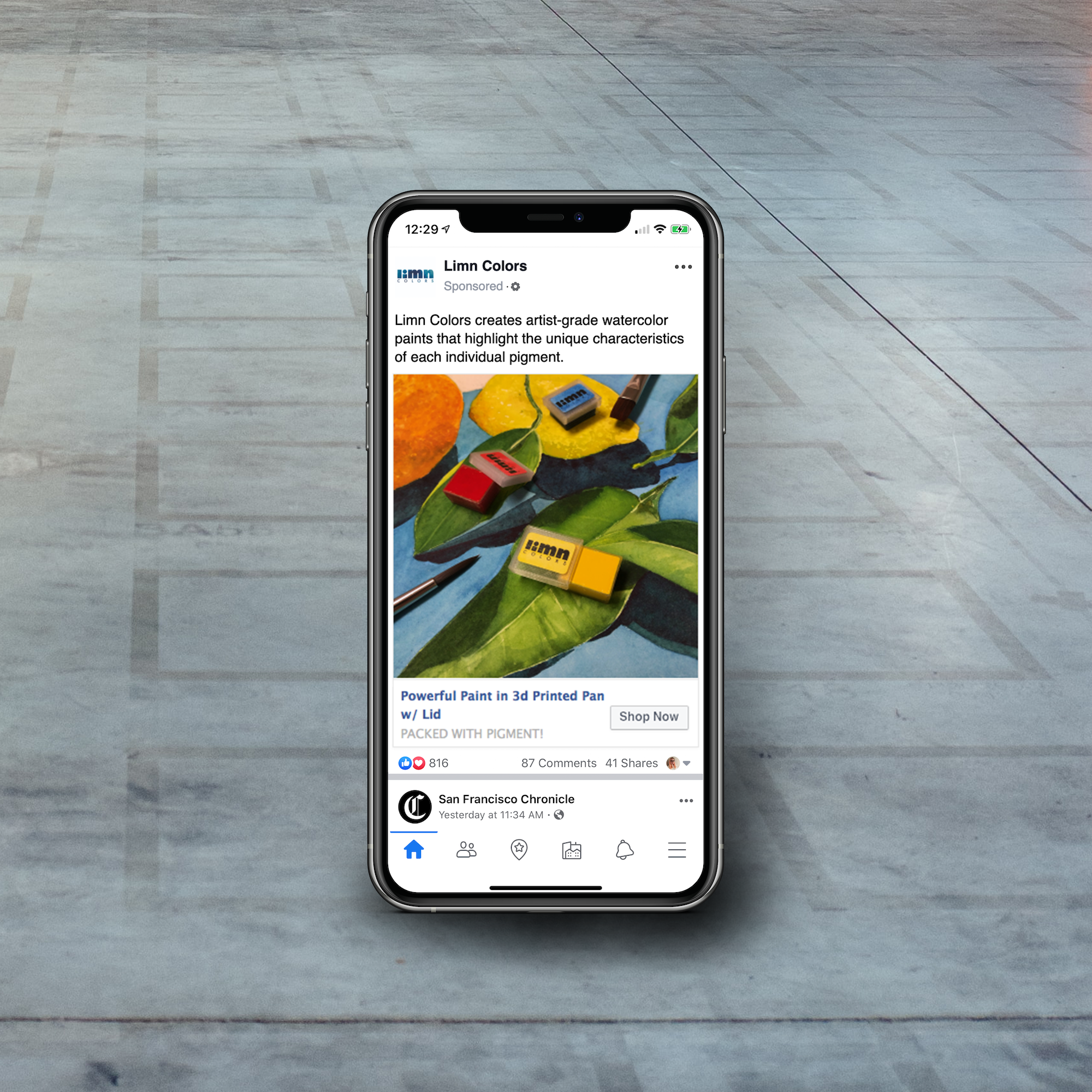
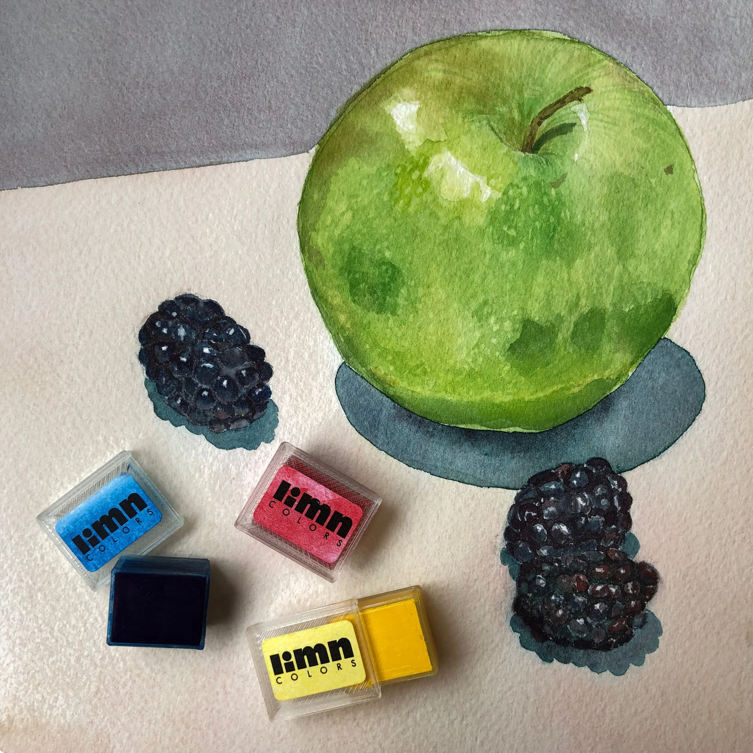
Limn Colors created hand-mulled, artist-grade watercolor paints that highlight the unique characteristics of each individual pigment. Paints are made from scratch, with premium pigments and no fillers, and packaged in 3d printed pans. The product line features historic and traditional colors alongside modern hues.
Brand and Business Cards
From the very beginning, the packaging and logo were distinctive. For the logo, the “l” was shortened to be the height of the “m” and the “i” was created from a square and circle at that same height. Futura, the geometric decisions, and the heavy letters are graphic and feel more designerly than many of the script-type, organic, crafty brands of competitors. Often the company is called “Limn” for short and that stands out visually in the logo. This helps the logo stand out on the busy backgrounds of paintings or lets it work with image fills in addition to solid colors.
The business card has a painted logo on the back and room on the front to add a paint sample or write a quick note at an in-person event.


3d Printed Packaging
The packaging was designed to be printed by me on a pair of Prusa 3d printers. They are printed in clear PLA so that the color of the paint shows through, plus PLA is compostable to cut down on plastic waste in the industry. The lids slide on to protect the paint during shipping, but removes fully so that the pan can snap into a standard palette. Pans sold as a set have a magnet on the bottom of each to secure them to the metal palettes; magnets allow customization and palette expansion. The packaging, both design and in-house fabrication, made the product immediately distinguishable.


LimnColors.com
The website presented Limn Colors e-commerce store, blog, paintmaking philosophy, and supporting pages.
The site had plenty of white space to balance out the colorful imagery and make it easy to read complex information. Most type is done in Futura, with the occasional introduction of Brusher as a display font.
The homepage featured a news and updates section with square tiles that were frequently changed. Each tile used a semi-transparent banner over a painting or paintmaking-related photograph.
Visit the Limn Colors website.


Advertisements
The focus for ads and marketing was often on the product itself and how it is made, color (and mixing), or the watercolor properties of a pigment such as granulation or opacity.
Many square ads were produced for carousel and single image ads on Instagram and Facebook.
A large variety of sizes and formats were created for use on the Google Display Network.
Promotional images for watercolor classes used the same format as the news tiles on the website, with a single bright color pulled from the image for the banner.


Design Process
Over four years of owning the company, I created most of the branding and promotional materials as needed (retail packaging and signage was outsourced). I took product and process photographs every day I was in the studio or at events to be used in marketing materials later. Almost all of the imagery was painted by me or my studio assistant, with the exception of social media posts that shared customer’s work.
See it on Behance

Design by Amanda Hinton
Contributors: Jessica Wassil, Jen Arzt, and Joe Bowers
Mockup templates from Envato