
Chromaculture Magazine Branding and Editorial Design
This project was to create a magazine from scratch, including concept, brand, layouts, content, and promotional material. Chromaculture is for artists, designers, and those obsessed with all things color.
Deliverables: Editorial Design, Marketing Creative, Print Collateral, Branding, Copywriting
Tools: Adobe InDesign, Adobe Photoshop, and Adobe Illustrator

About Chromaculture
Chromaculture Magazine is a (fictitious, for now) quarterly print publication with an inspiring and educational collection of stories about palettes, pigments, and projects that are color-related. The companion website features digital versions of the magazine, additional content, and interactive resources. The magazine presents color theory, scientific topics, and technical issues in a way that is modern, provocative, and playful—approachable and fun but in no way dumbed down.
Brand
The Chromaculture brand marries bold looks with deep knowledge of the subject matter. Visuals are colorful and often-times unexpected. These brand colors look good on black or white and in potent pairs, though they purposefully vibrate.
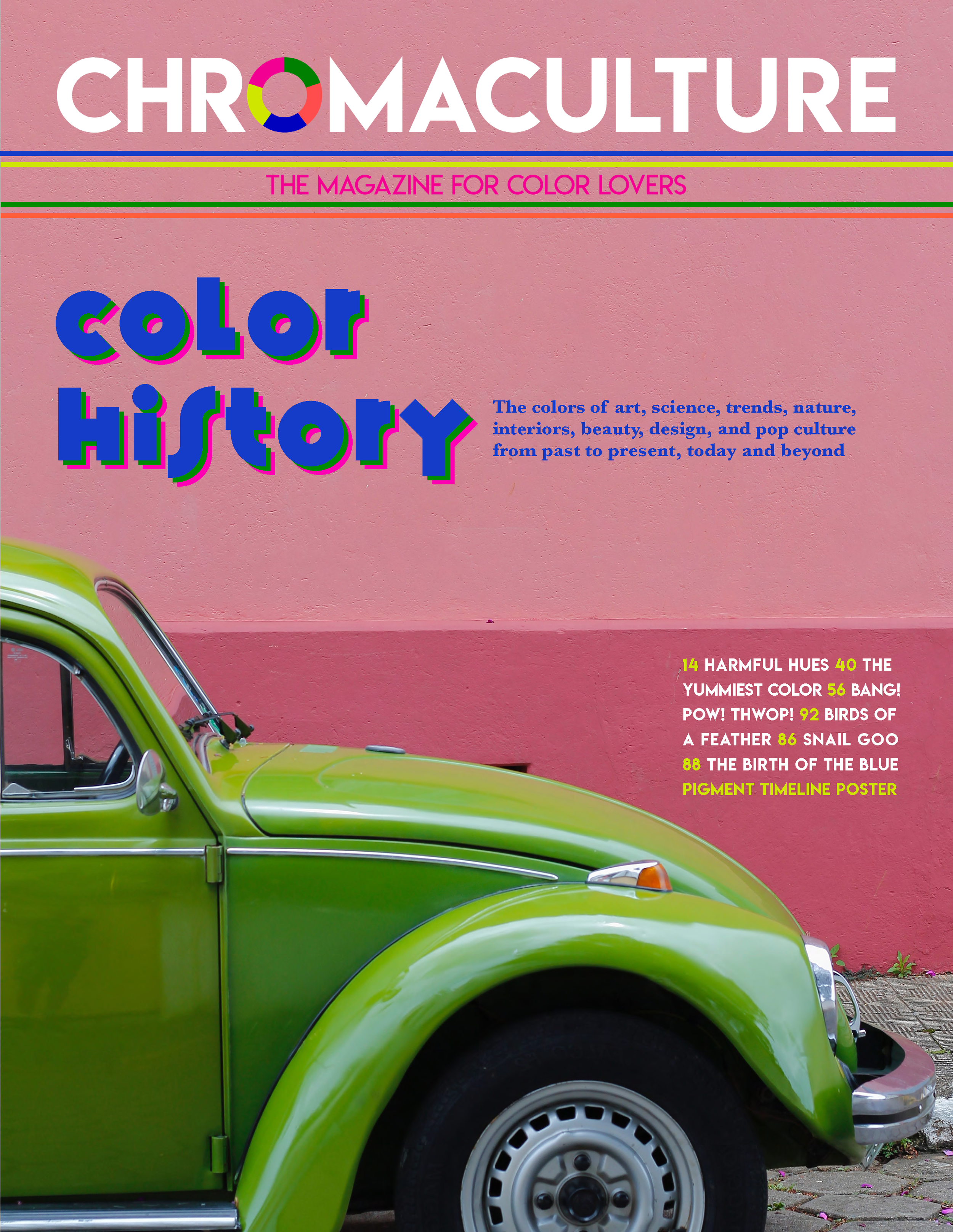
The logo features a twist on a color wheel, subbing in more electric hues and shuffling the arrangement to keep it from looking too much like a rainbow. The masthead includes a tagline inside color bars, which can be also be used as decoration or to divide content.


Magazine
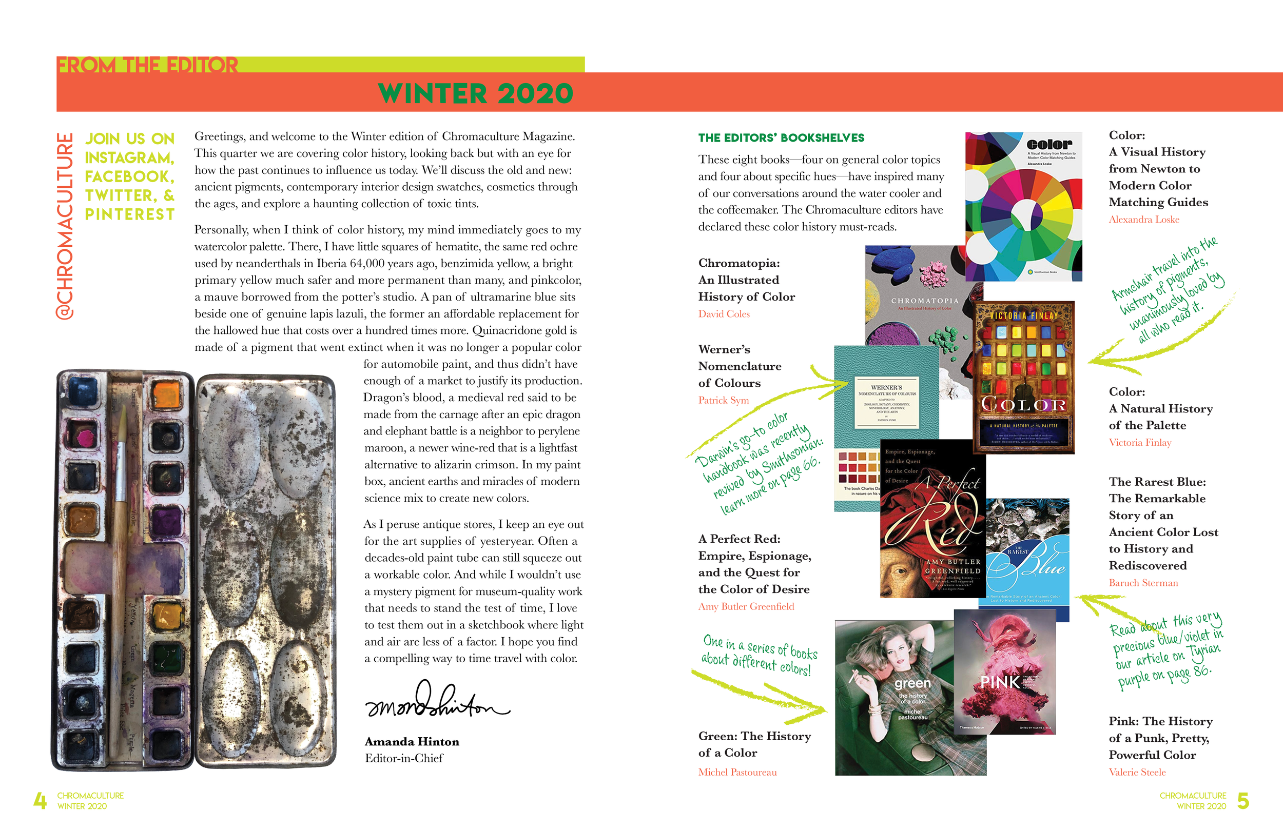
The font Lemon/Milk is a small indie font initially created for a zine. It works well as bold, graphic type in each of the brand colors. This font is often used with the top or bottom of the text bleeding into a same-colored fill. Baskerville was selected for its historic use in scientific books, such as those for color theory, as well as a nod to his innovation in printing and black ink.
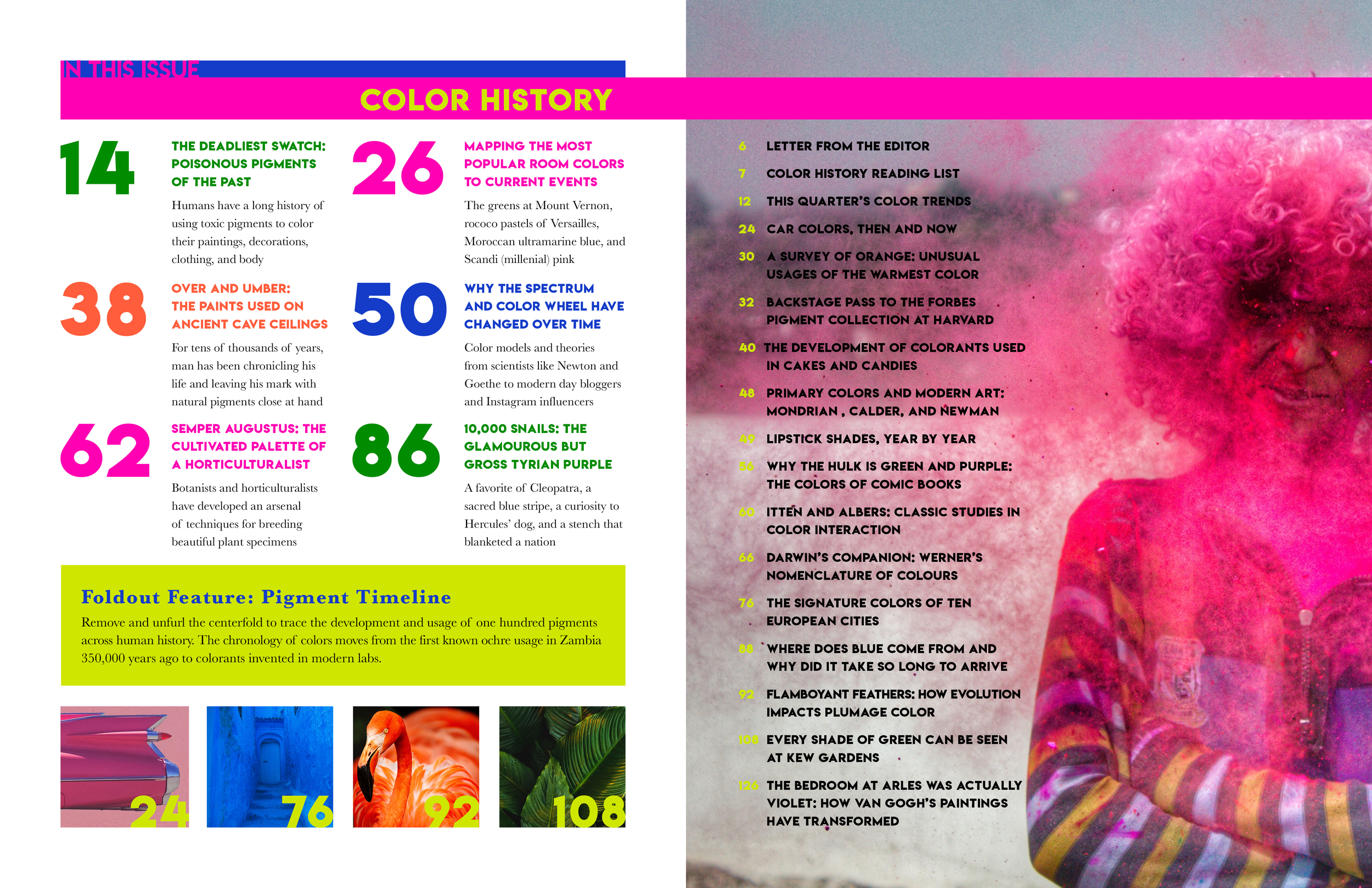
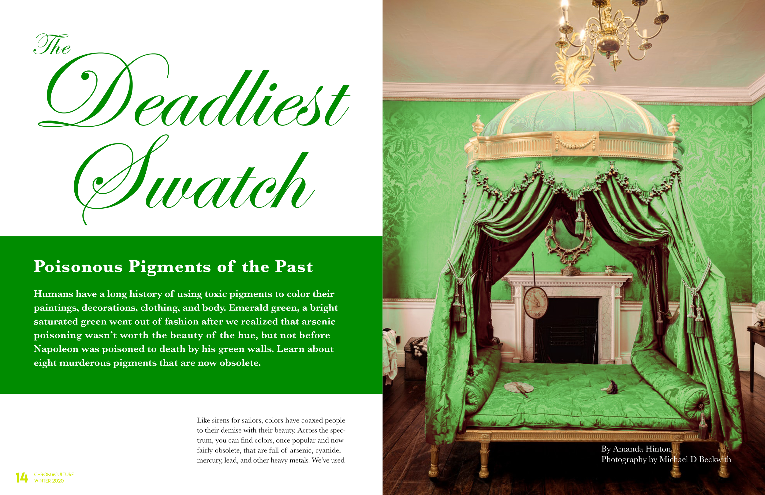
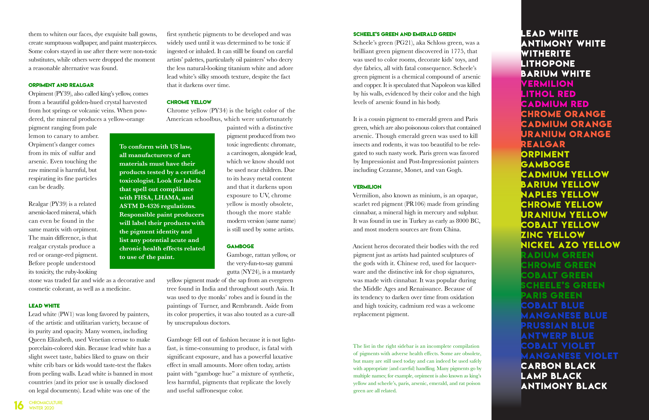
Doses of color, such as the four feature article thumbnails on the table of contents spread or the spectrum of pigment names on the toxic colors sidebar, are peppered throughout.

Print Collateral
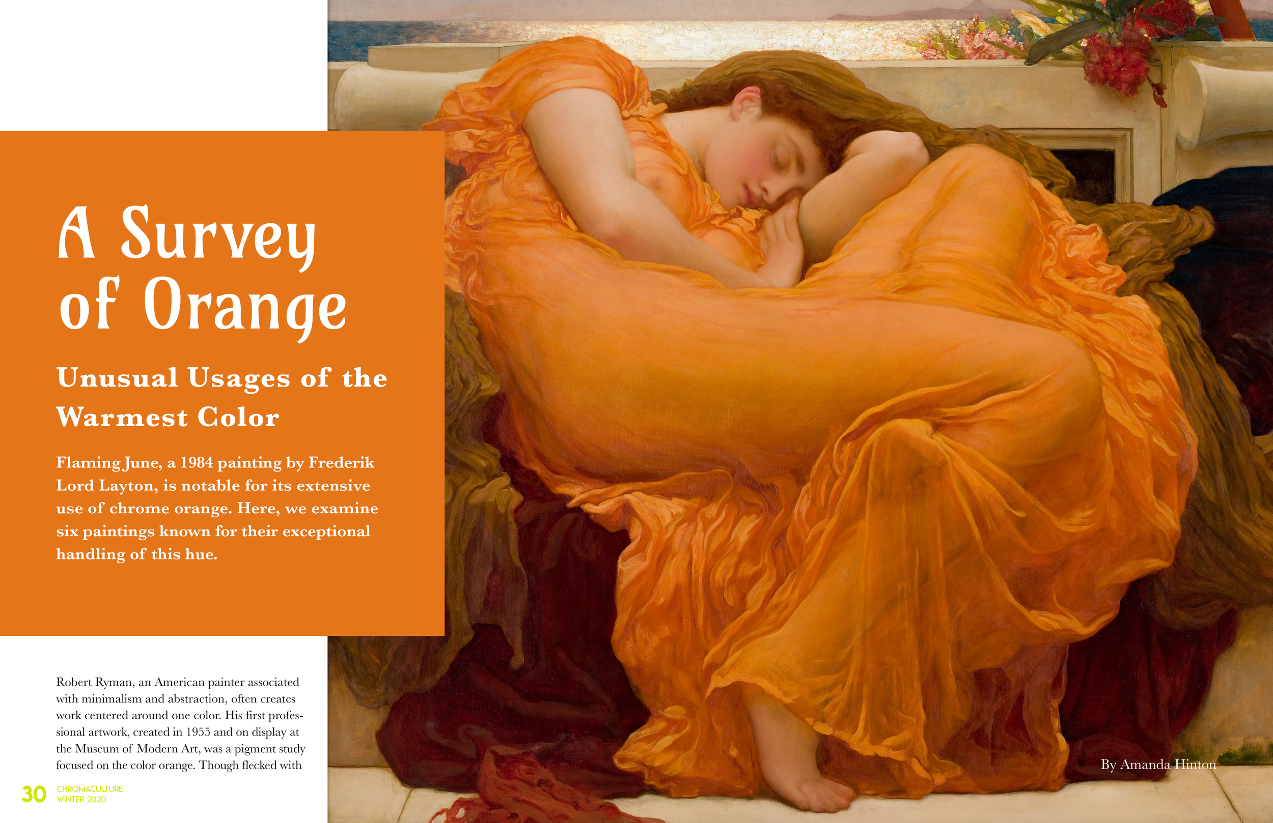
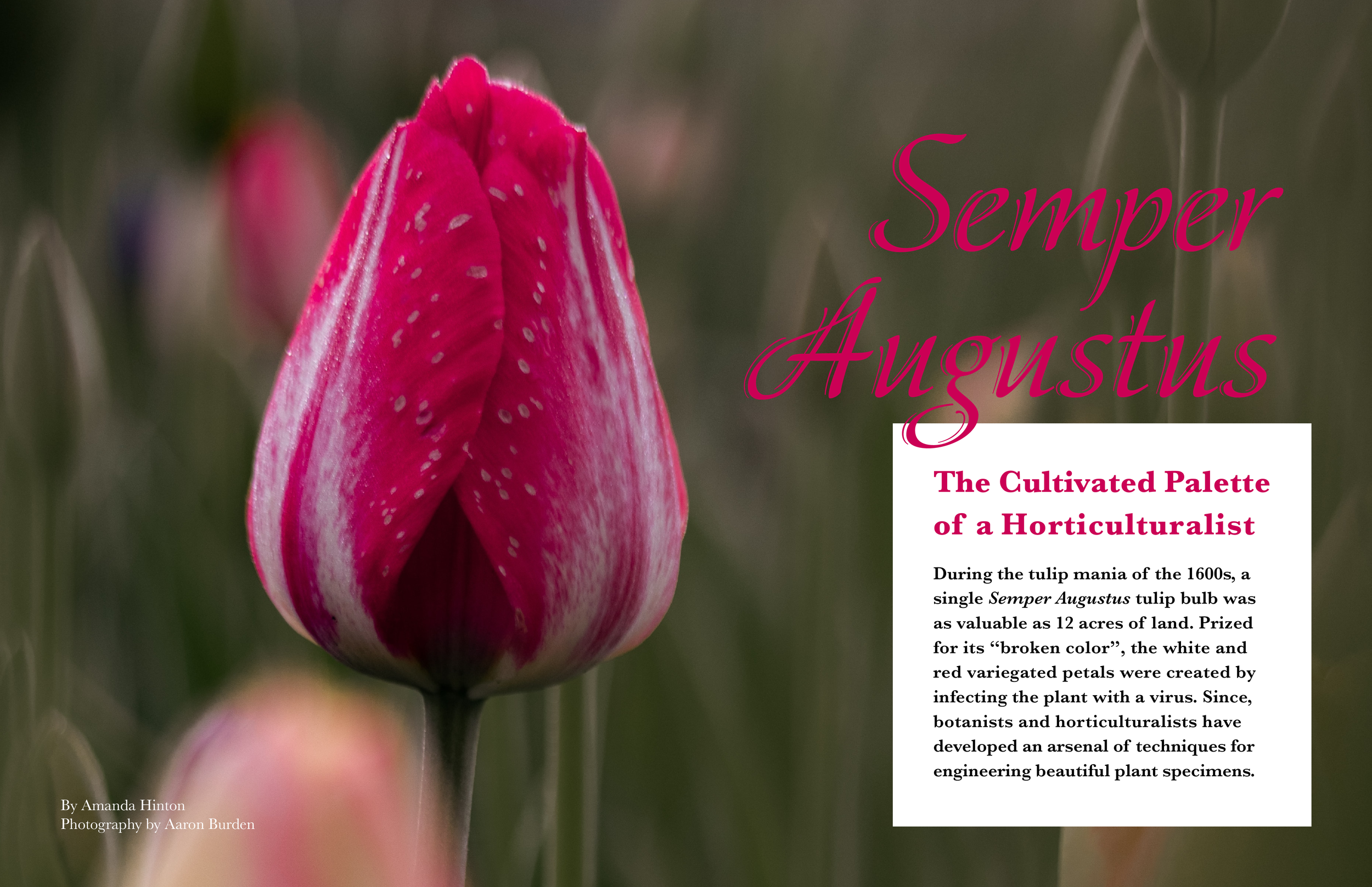
For Chromaculture-branded materials, I selected photographs that aligned with the color palette and had a sense of movement or referenced light and optics. Imagery felt “instagram-worthy” and had a nod to an artistic lifestyle.
The trifold-brochure is for account managers to use to sell advertising space in the print magazine. The postcard can be used as a flyer and go inside the newsstand magazines to encourage subscriptions.


Design Process
I have years of research behind (and hopefully ahead of) me in color theory and pigments. I used that knowledge and additional research to write all of the content for the magazine.
To select the colors, I used Adobe Color and began with a riff on the primaries with ultramarine, magenta, and chartreuse. I added green as the complement to pink and coral (which was Pantone’s color of the year when this brand was formed) to oppose the blue. As this is a side project for me, modified versions of my personal brand colors make up part of palette. The concept of this publication is an extension of my aesthetic and approach to color.
I sifted through endless pages of photography to create a collection that felt right for use in articles and collateral. And where needed, I took my own photographs.
See it on Behance

Design by Amanda Hinton
Photography by Michael Beckwith, Aaron Burden, Vasundhara Srinivas, Adrien Converse, Efe Kurnaz, Rodion Kutsaev, Elena Koycheva, Alan Emery, Josefin, Junior Machado, Neonbrand, Clem Onojeghuo, Federico Gutierre
Artwork by Frederik Lord Leighton, Ankit Sinhaghton
Mockup templates from Envato