Composition Art Lab Book
This book is geared towards people who want to practice art—including painters, photographers, illustrators, makers, graphic designers, etc.—but is also great for people who want to learn more about experiencing art and reading images.
Preview the Composition Art Lab book >>
Deliverables: Research, Writing, Editorial Design, Ad Creative
Tools: Adobe InDesign and Adobe Photoshop
About Composition Art Lab
Composition Art Lab began as an app and 60-day online art intensive that included daily lessons, art examples for each concept, project prompts, a forum, and live sessions with the group and professional artist mentor. The goals of the program were to give people the terminology to analyze and discuss their art and others’, get people beyond thinking art is “not for me” or that their work is not good enough, to help users sustain a daily art practice or creative habit, and to help artists create stronger work. It was geared towards people who want to practice art, but was also beneficial for people who wanted to learn more about experiencing art and reading images. The content that I wrote for the app/class was developed into this book.
Book Design
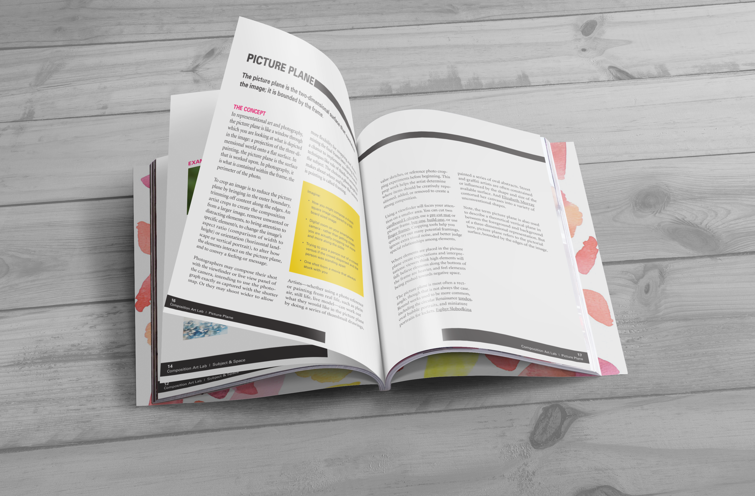
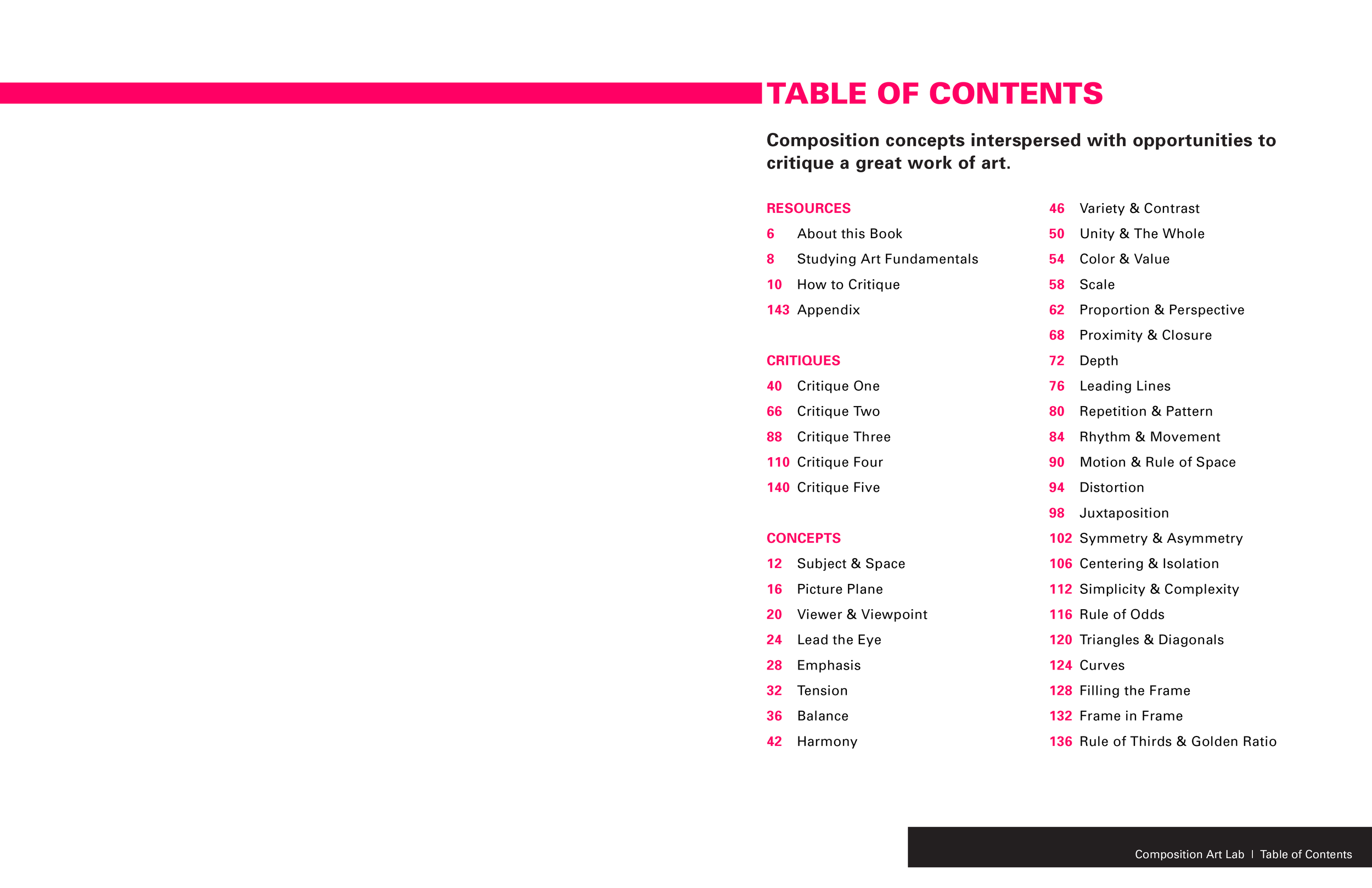
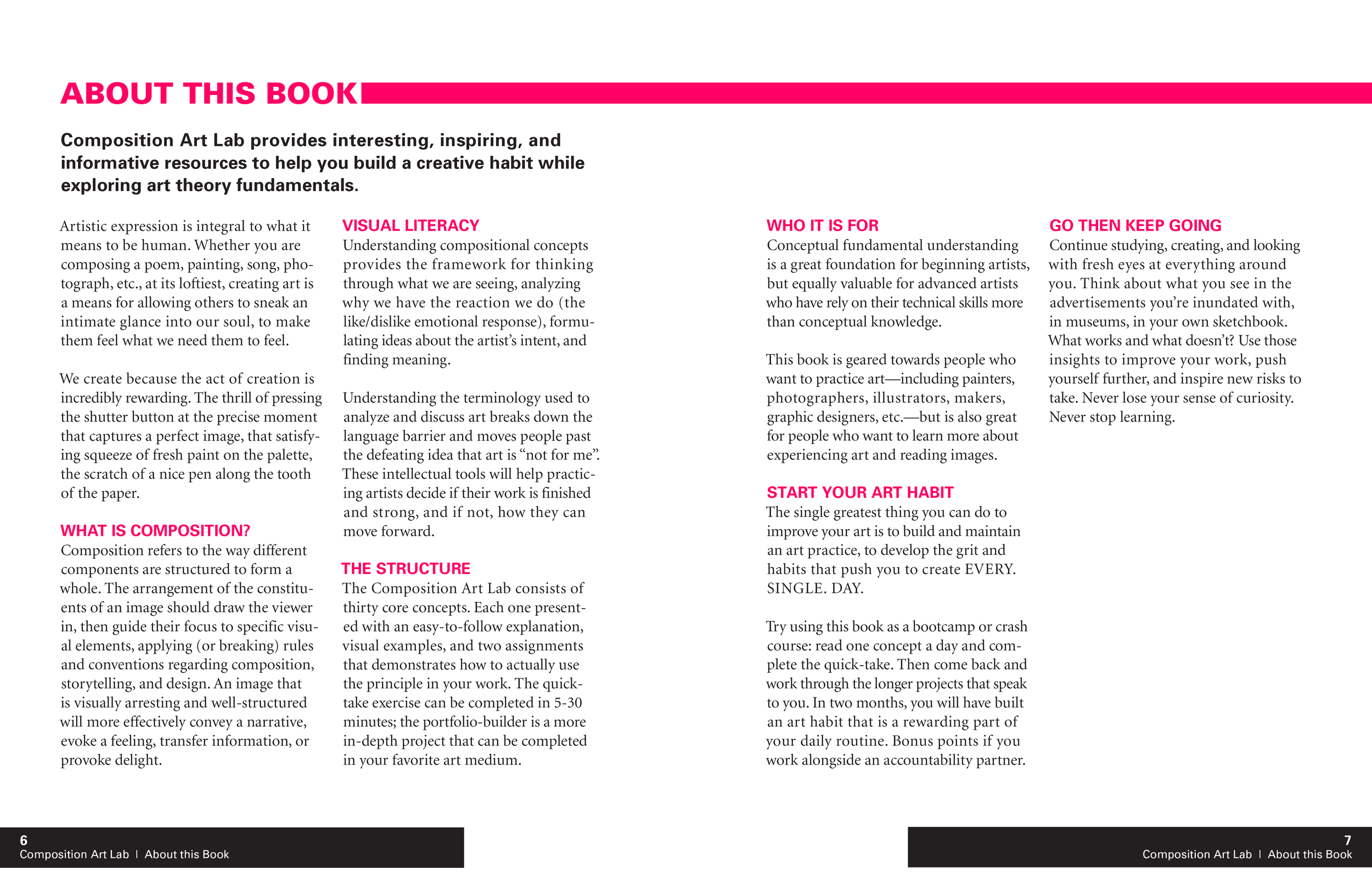
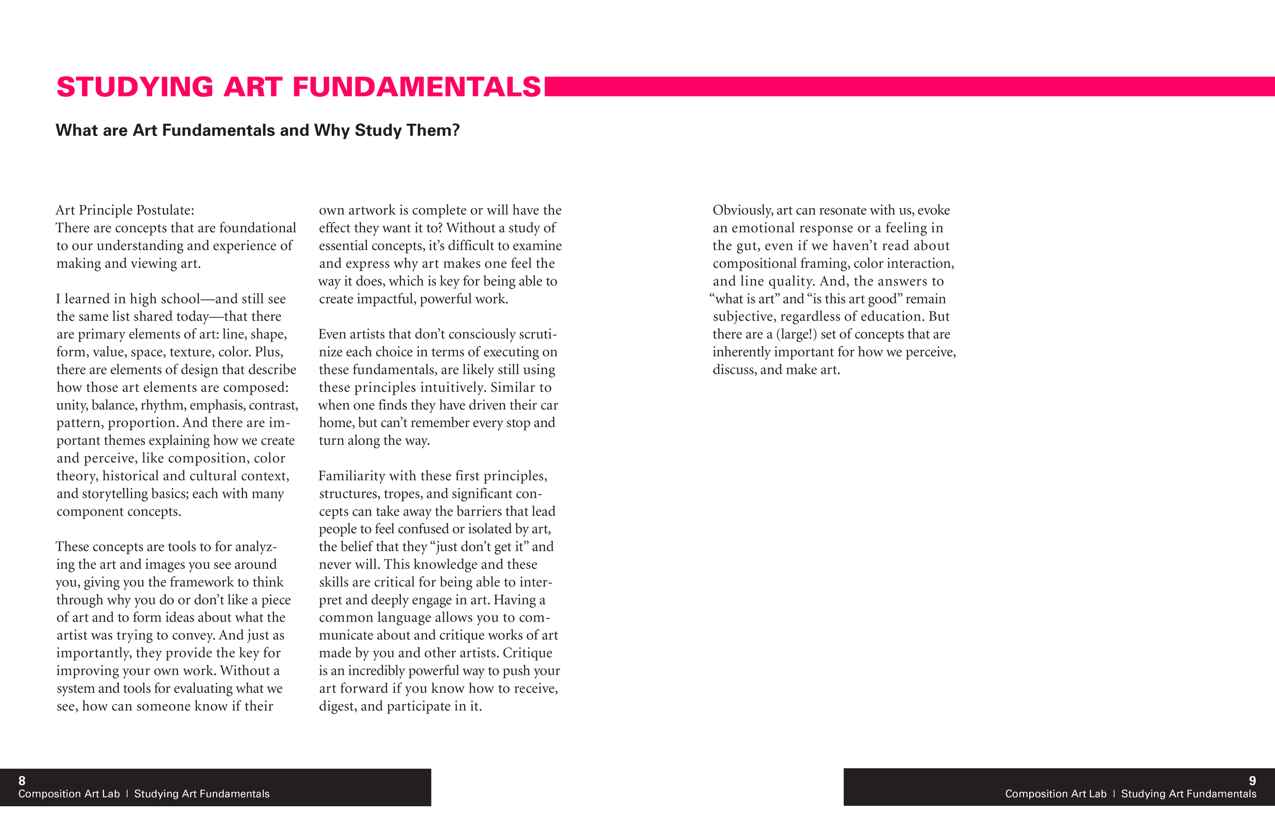
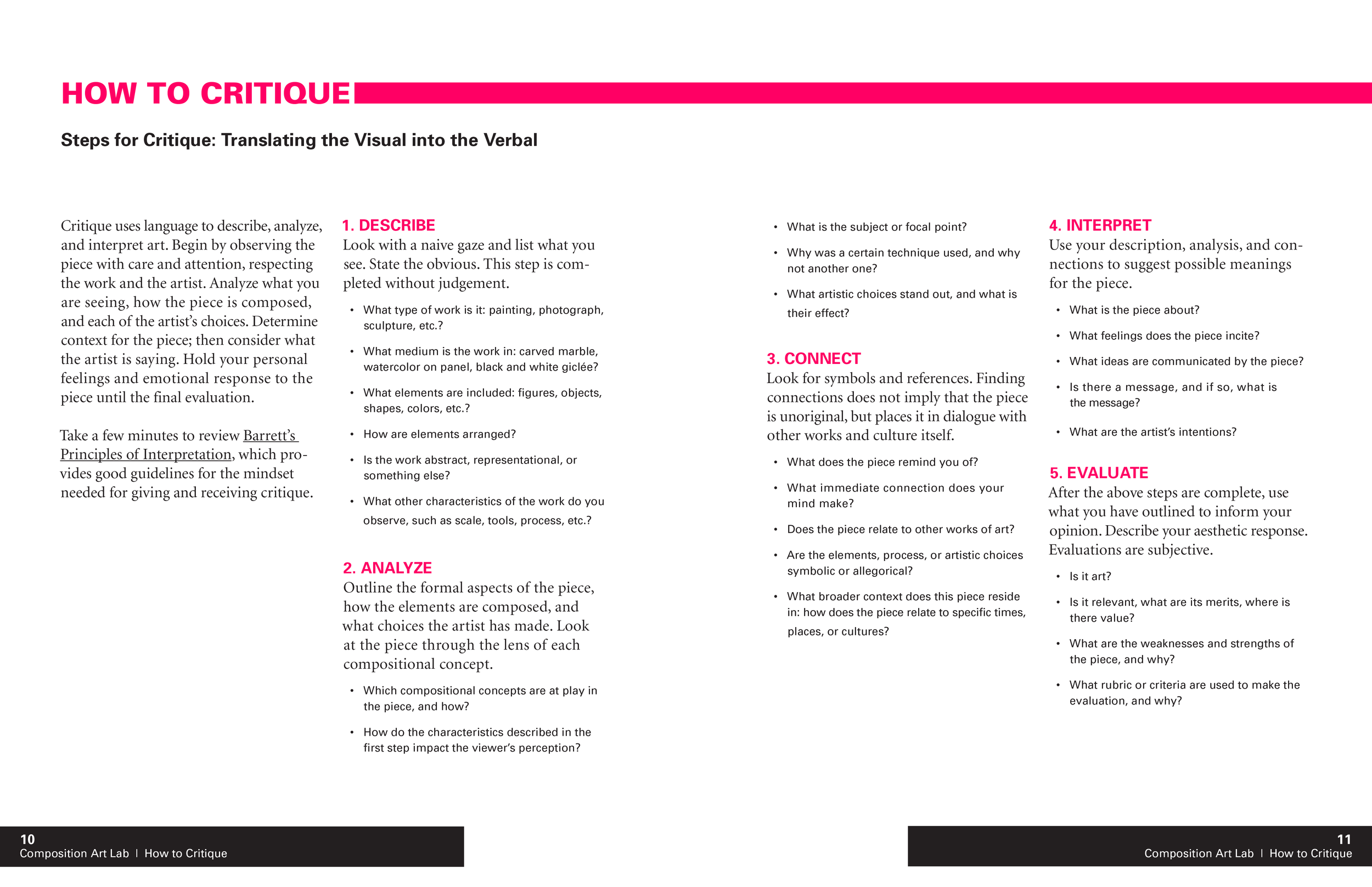
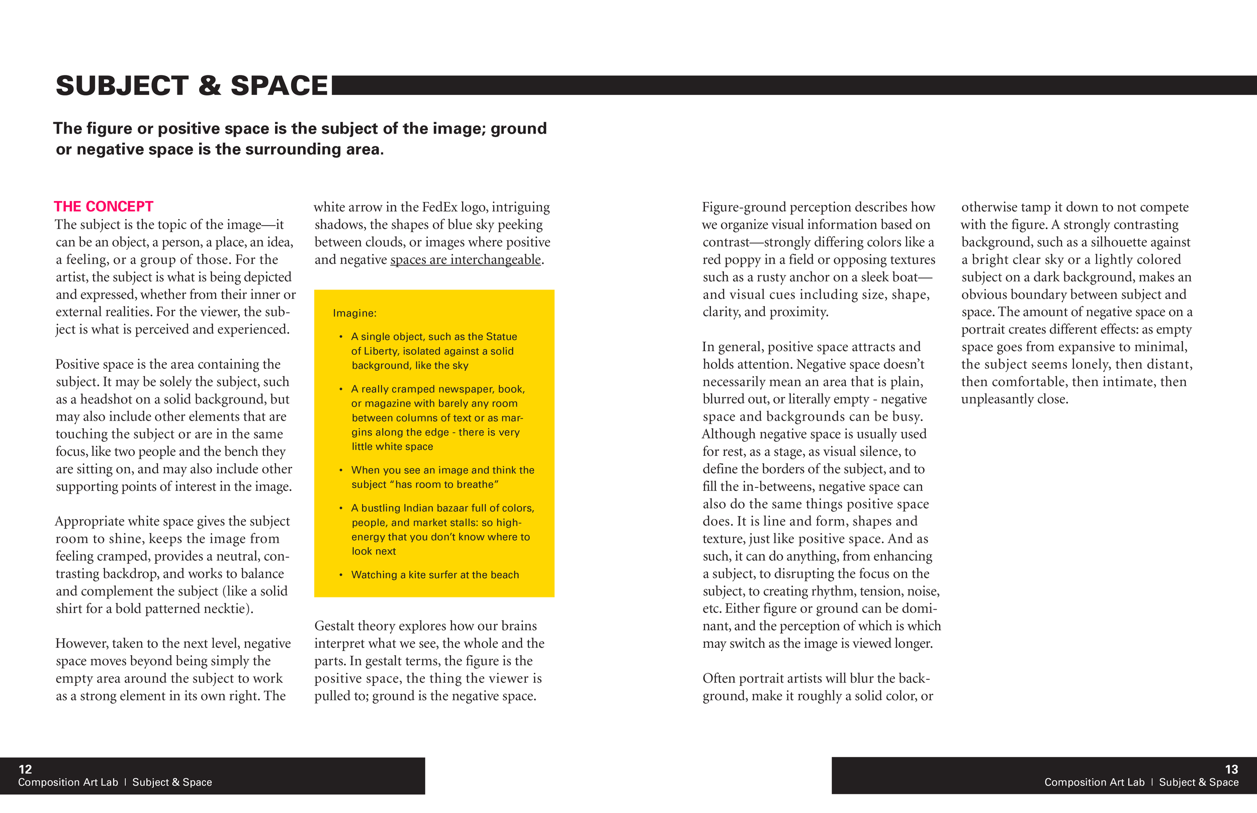
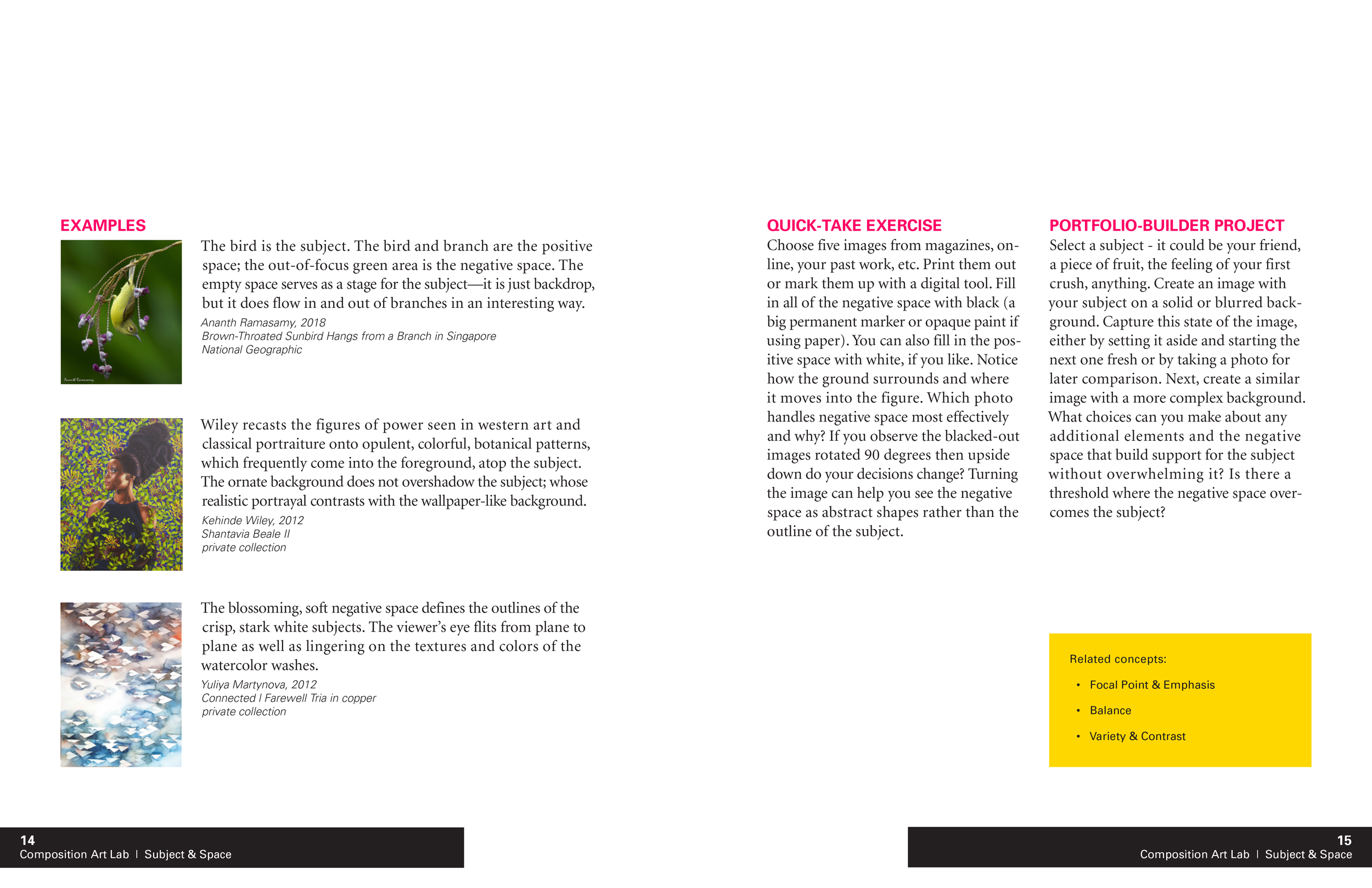
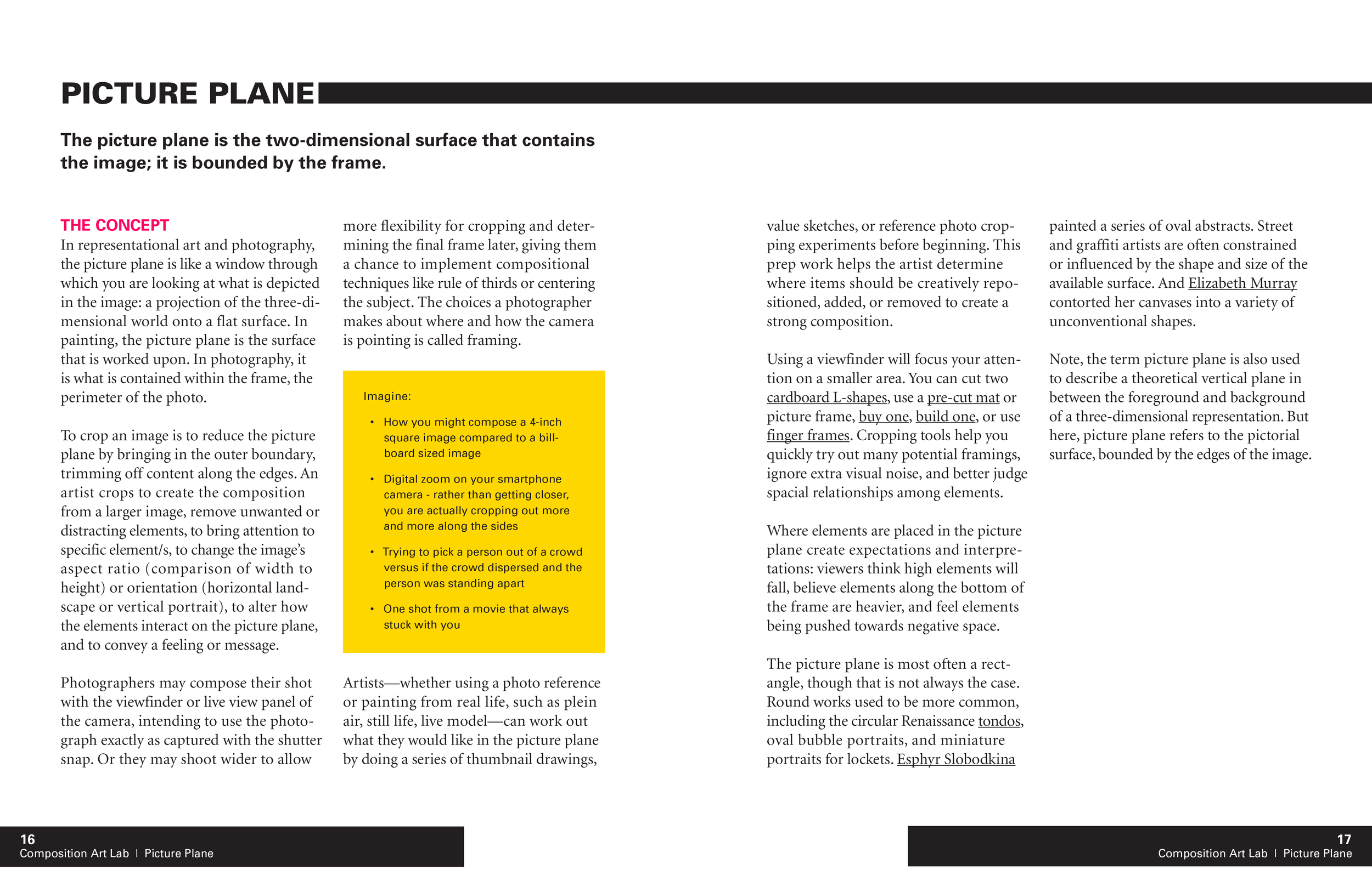
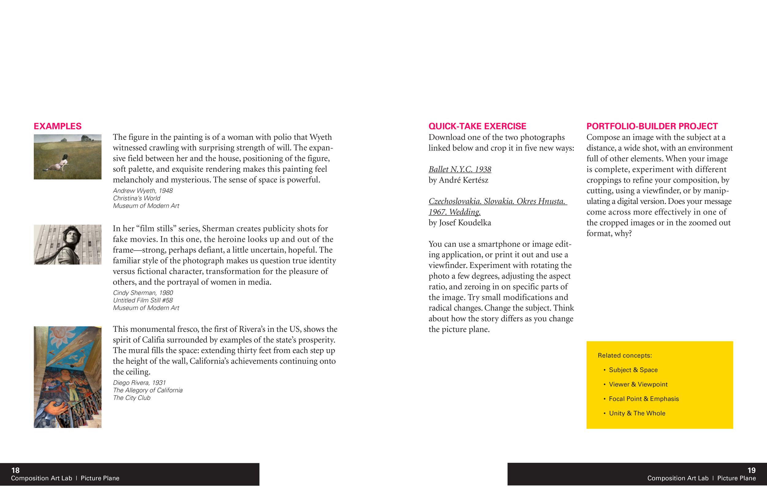
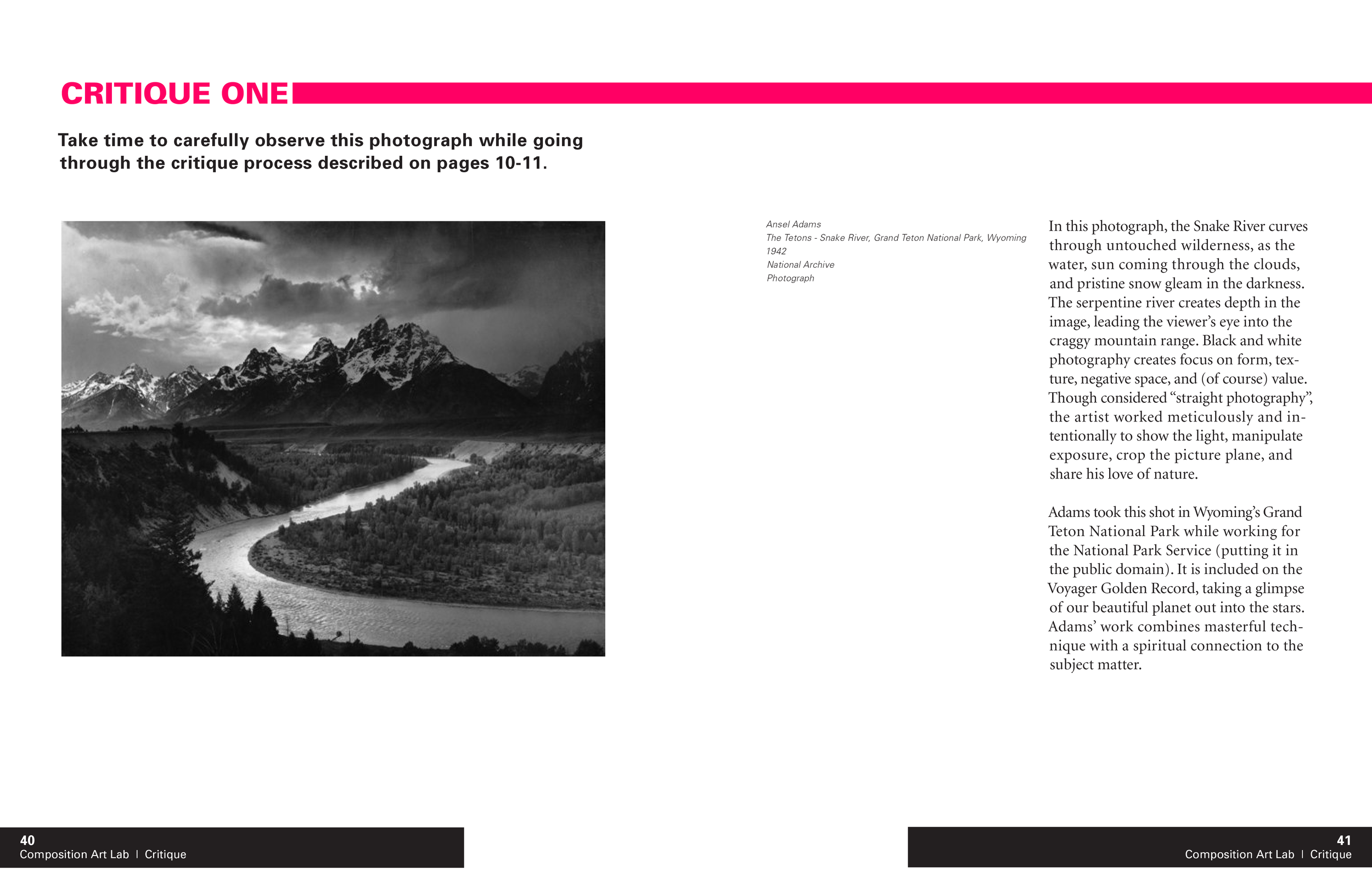
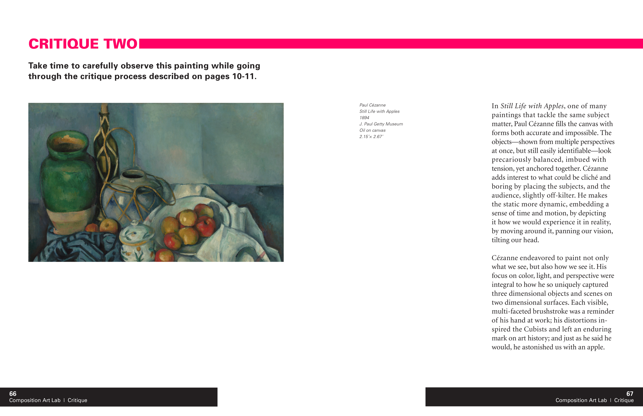
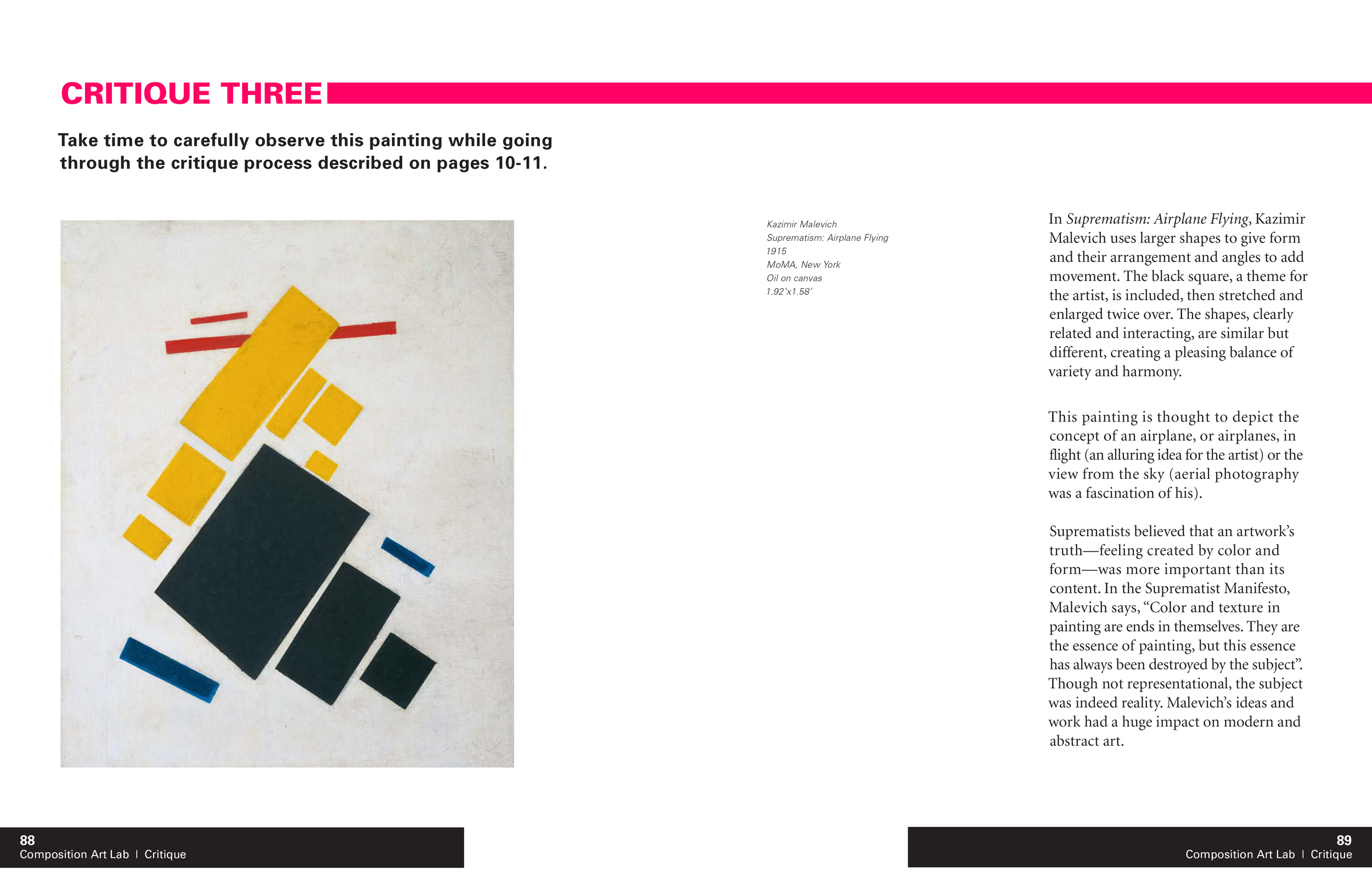
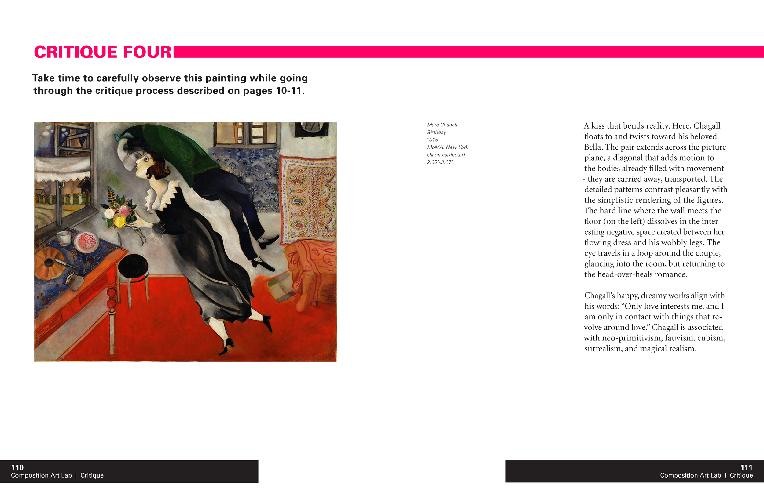
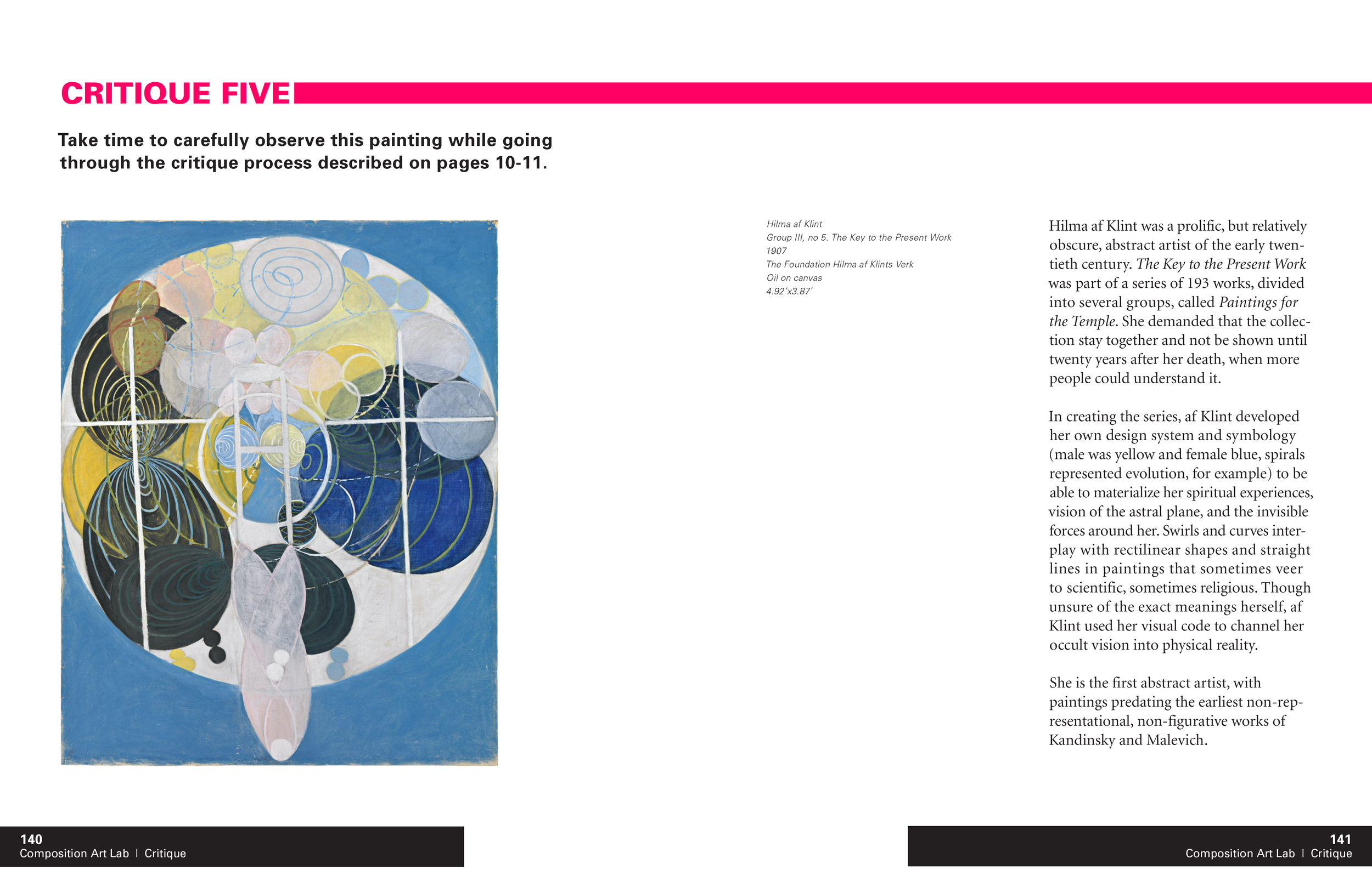
Content placement is highly consistent across thirty topics: title, introduction, concept, imagine bullets, art examples, exercises, projects, and related concepts. Hangline, columns, yellow callout boxes create cohesion. Wayfinding through titling and folios helps the reader stay oriented on what they are learning and navigate by topic.
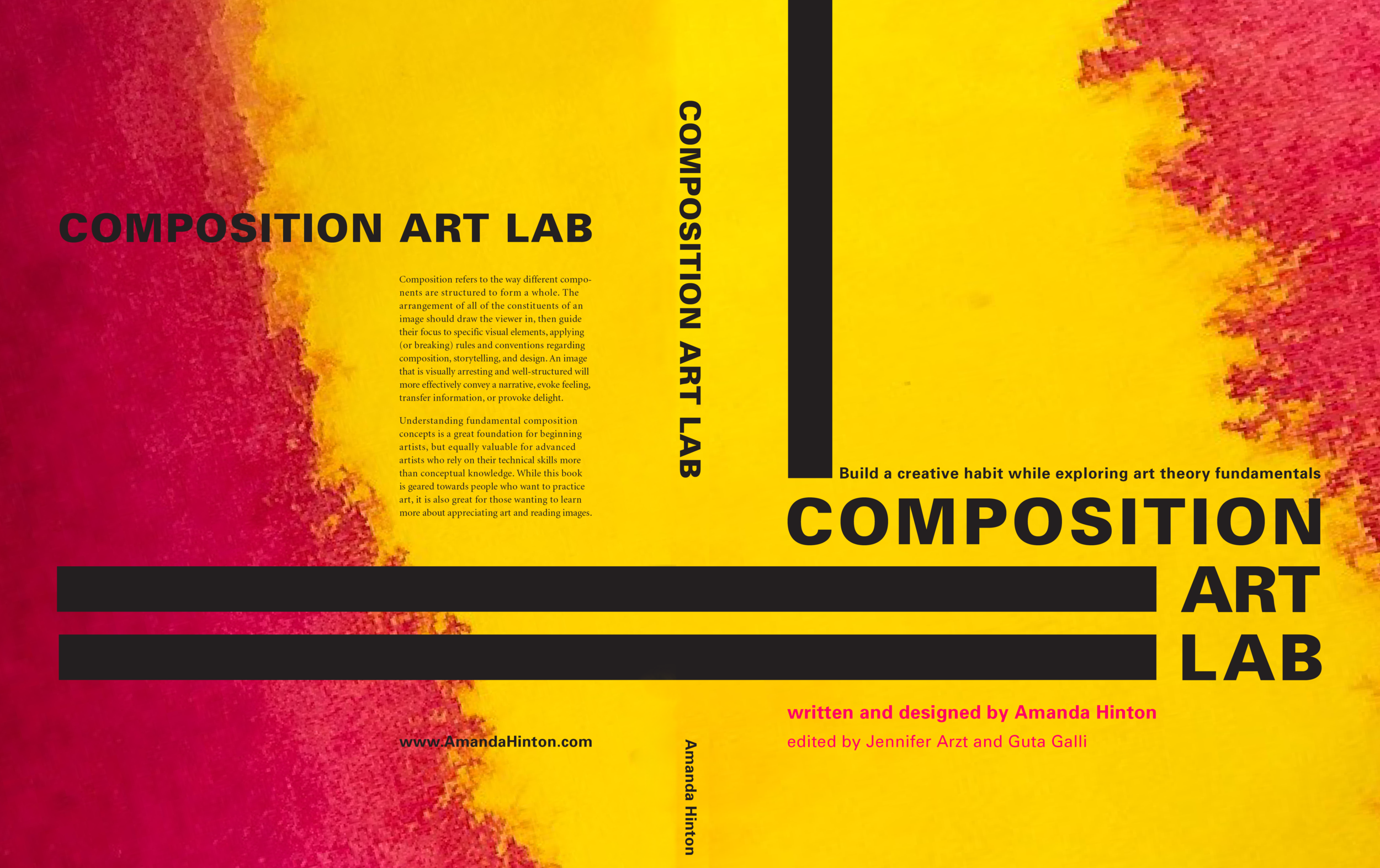
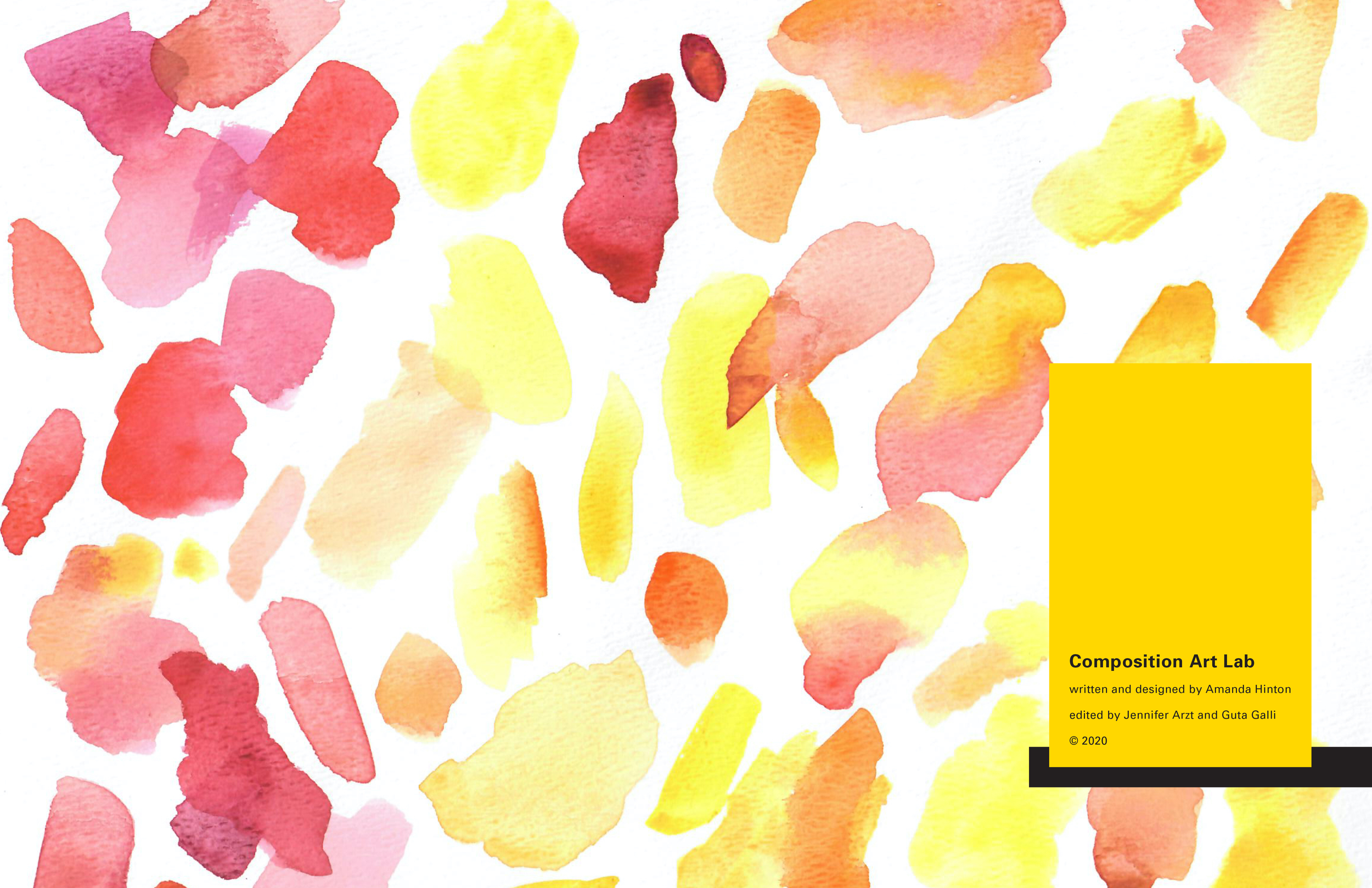
The watercolor swatches decorating the cover and endpages reference my own art practice, which inspired the book. It also gives the impression of art, without being specific about what kind of art, without being either representational or abstract, and has more of a sketchbook or experimentation feel.
Look and Feel
The book is intended to feel modern and more like an app than an old textbook. It attempts to balance approachability with expertise/authority. Lots of white space is given and content has enough kerning and leading to make it easy to read and airy.
Color Palette: Black, White, Yellow (r255 g215 b0), and Pink (r255 g0 b100)
Typefaces : Univers and Minion
Ad Campaign
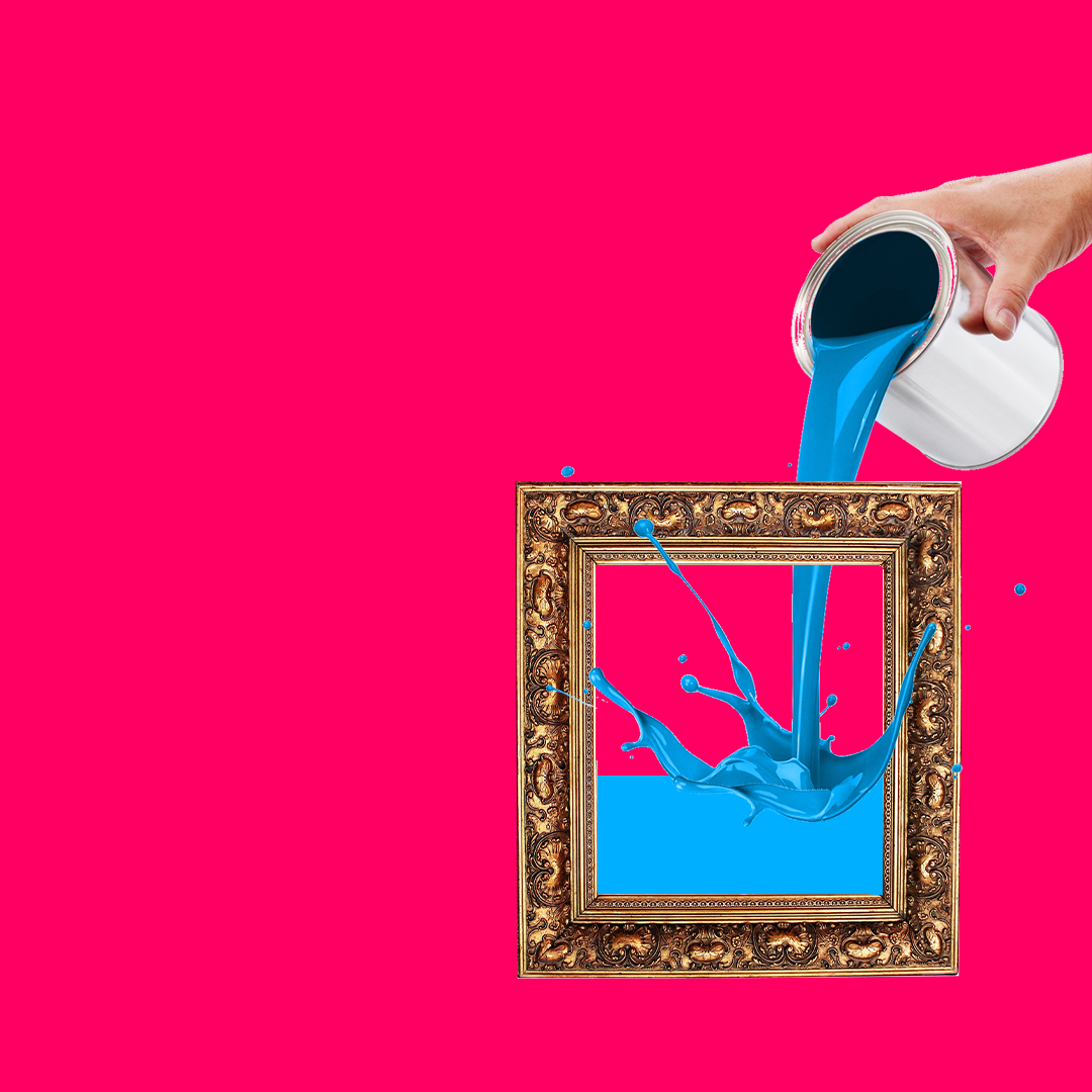
A cheeky ad campaign was created to call attention to some of the composition principles featured in the book. Bright colors caught the eye, a playful spin on the name of the concept made an intriguing image, and the text of the ad told the joke.
Multimedia Illustrations
I created a series of illustrations across a variety of media to use on Instagram. These were less about composition, but to show that artists in any medium using any subject matter were welcome in the class.
Design Process
To present thirty subjects in visual composition in a clean, organized way that reflects the subject matter. To nod to the original colors of the online app: pink and yellow with strong black graphic elements. To make it easy to find any subject. To intersperse the concepts with opportunities for the reader to critique a famous piece of art. Attention to typesetting.
I created a modular grid in InDesign to use across the different types of content, before customizing each on to the best fit each section: informational pages at the beginning, four pages for each concept, and two pages for the critiques. I worked on each section individually, iterating according to the length of content and sizes of artworks from page to page, building a general spread layout that worked across each of the thirty concepts. I made small adjustments to positioning through copyfitting.
See it on Behance
Design by Amanda Hinton
Contributors: Jen Arzt, Guta Galli
Mockup templates from Envato and PlaceIt

